Simplify User Actions – They Need Energy Just to Click “Buy”
In short
Every tap costs users energy, so onboarding should make actions easy. The first iPhones let the thumb reach the whole screen, but today’s larger devices do not. Design interfaces that are easy to use, not only beautiful, minimize cognitive load and keep answer options equally reachable, so users are not pushed toward the choice that is easiest to reach.
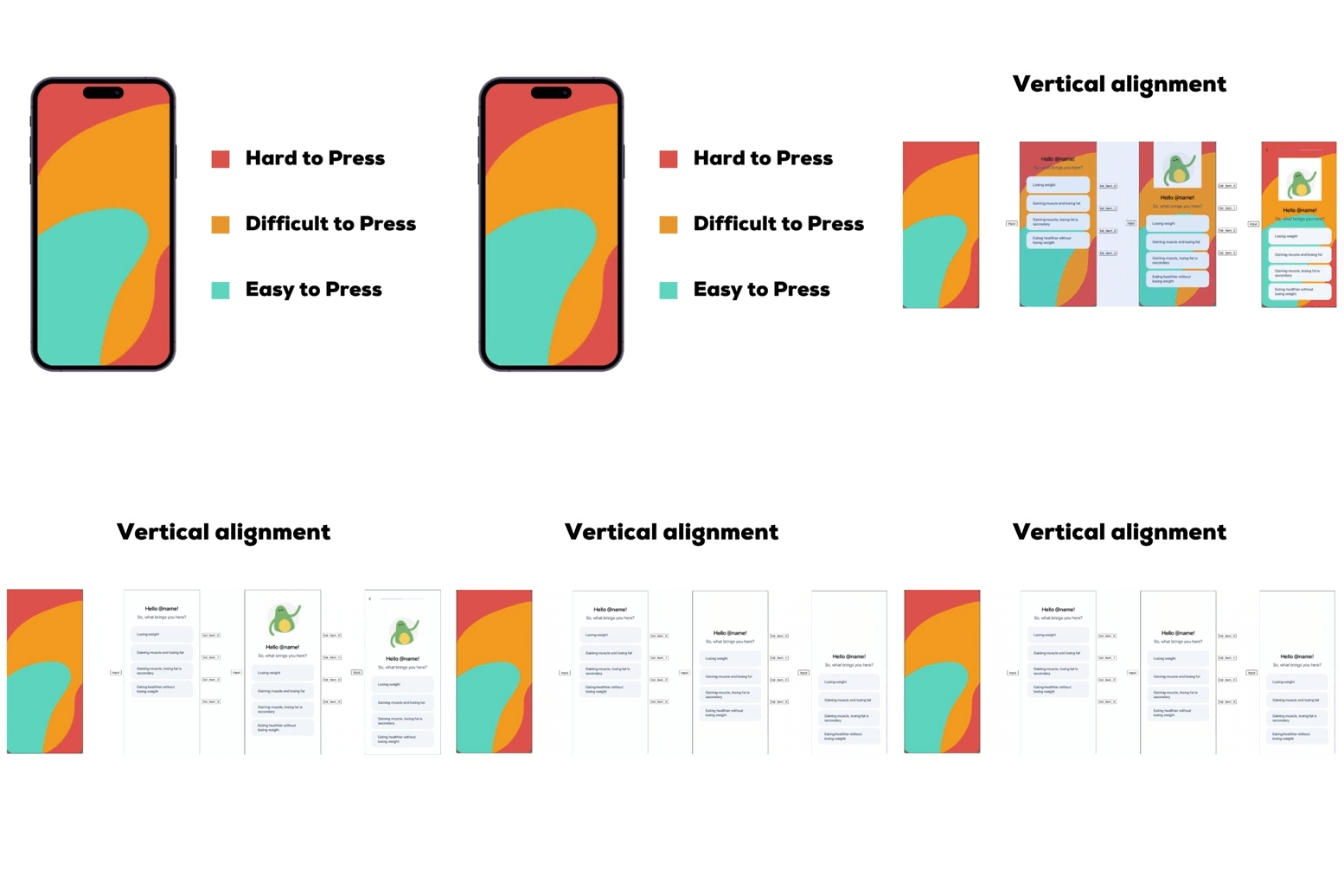
🥸 The first iPhones were designed so users could easily reach any part of the screen with their thumb.
💡 Devices have gotten larger – keep that in mind when designing UX.
- 1. The interface should not only be beautiful but also easy to use.
- 2. Cognitive load should be minimized.
- 3. Options in lists should be equally accessible – don't push users towards choices just because they're easier to reach.
- 🤓 Experiments with vertical alignment can be costly if you're onboarding via development, but they can significantly impact user choices and final conversions.
Key takeaways
- The first iPhones let users reach any part of the screen with their thumb; today’s larger devices do not.
- An interface should be easy to use, not only beautiful, and keep cognitive load to a minimum.
- Answer options should be equally accessible, so users do not pick one just because it is easier to reach.
- Vertical alignment experiments can be costly when every change needs development, but they can shift user choices and final conversions.