Onboarding Tactics: Reduce the Complexity of Each Action on a Single Screen
In short
Onboarding tactics reduce the complexity of each action on a single screen. Remove unnecessary elements, use pictures that help perception without distracting, split an overloaded screen into two, keep text easy to read and use familiar UX patterns. In InPulse, that means placing the question next to its answers and removing the Continue button and checkboxes.
Checklist to reduce the complexity
- Remove unnecessary elements.
- Use pictures to enhance perception without causing distractions.
- If a screen appears overloaded, consider dividing it into two screens.
- Make sure the text is easy to read
- Use UX patterns familiar to users.
Let's enhance the InPulse onboarding experience
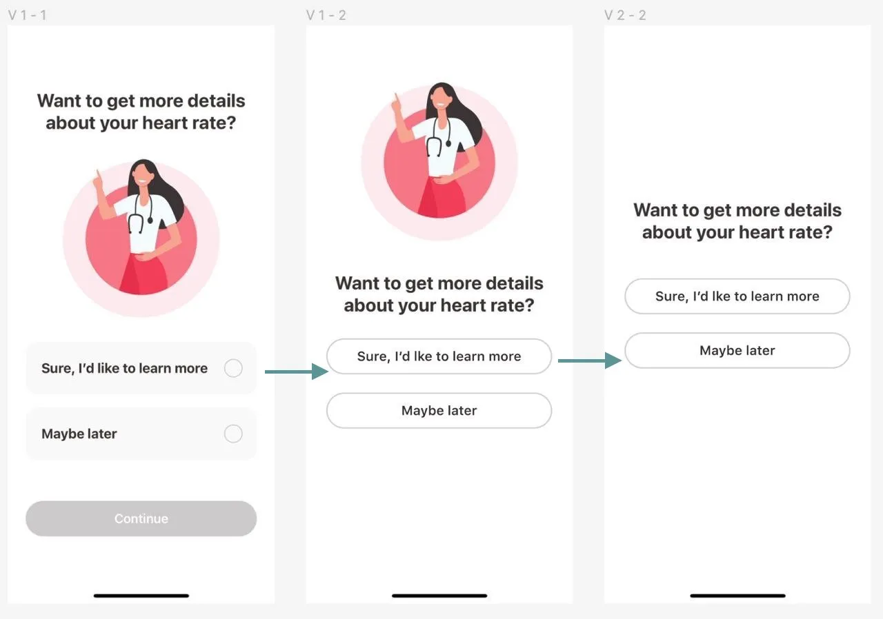
- Place the question and answers next to each other (removing the distracting picture in between).
Remove unnecessary elements:
- The Continue button
- Checkboxes on the list items (since only one answer can be selected)
Key takeaways
- Remove unnecessary elements, and split a screen that looks overloaded into two.
- Use pictures that support perception without distracting from the message.
- Keep text easy to read and use UX patterns that users already know.
- In the InPulse heart-rate question, the question and its answers belong next to each other, without the distracting picture in between.
- On a single-choice screen, the Continue button and the answer checkboxes are unnecessary, since only one answer can be selected.