Reducing Cognitive Load to Increase App Revenue
In short
Users buy when the potential profit outweighs the resources they spend, so every bit of effort onboarding saves raises the chance of a purchase. Reduce cognitive load at three stages: make screens easy to recognize, help users understand the whole picture, and make the next decision and action simple, including branching the flow for important segments.
Onboarding is the first interaction a user has with your app. Users invest time and "cognitive effort" expecting your product to meet their needs.
💡 The fewer resources they need to invest, the higher the chance they will complete the onboarding and purchase your product.
Potential Profit > Resources Spent = Purchase

To increase purchase chances, you can reduce complexity and increase the potential profit for your users.
In this article, we will explore how to reduce cognitive load.
Cognitive load consists of several components:
- Recognize (decipher the picture, read the texts)
- Connect and understand (combine everything seen into a coherent picture to grasp the message)
- Make a decision and implement it
Each of these tasks requires effort, and by reducing this effort, you increase the chance of purchase.
1. Simplifying Information Recognition
1.1 People find it hard to process more than 5-7 items simultaneously (Miller's Law).
💡 Review each screen and remove unnecessary elements. If removing elements is not possible, break one screen into several. (Analogy: it’s easier to lift a 5kg dumbbell 10 times than to lift a 50kg weight once).
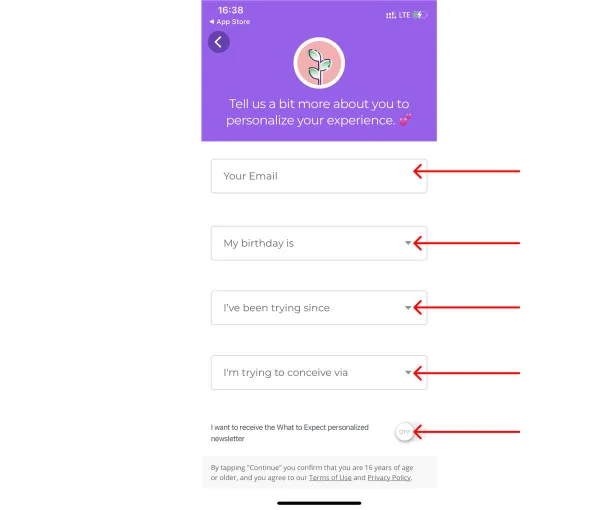
❌ Bad Example:
Pregnancy & Baby Tracker WTE app asks for a lot of information on one screen.
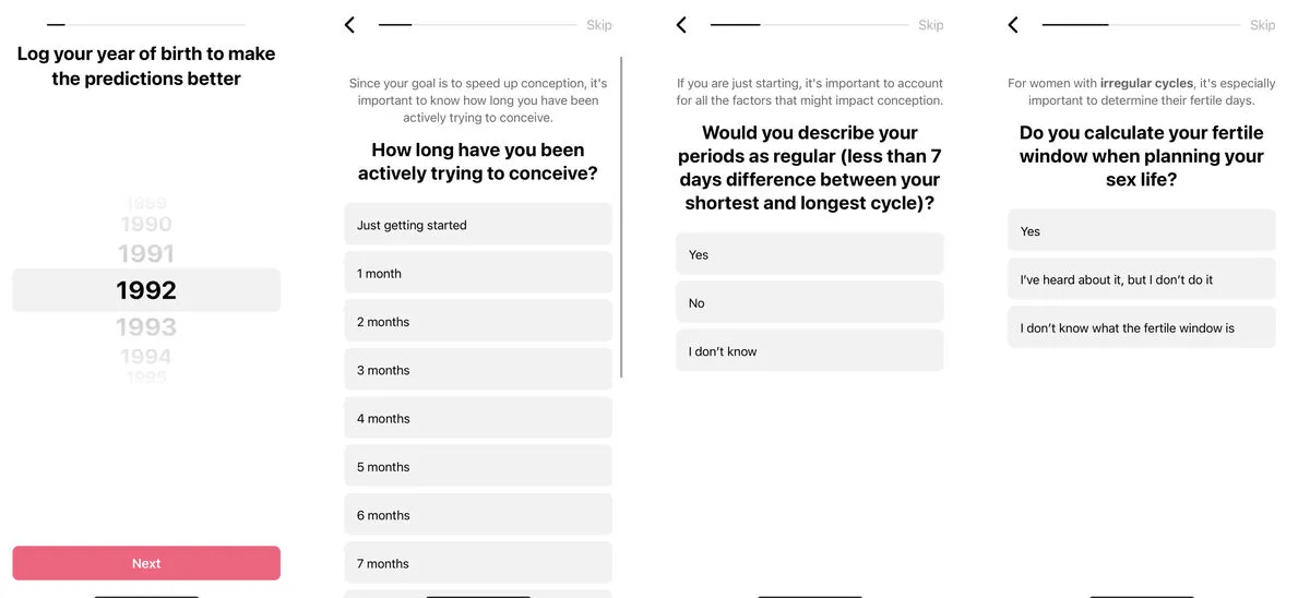
👍 Good Example:
Flo Period Tracker & Calendar breaks data entry into simple, understandable steps, reducing cognitive load.
1.2. Text Should Be Easy to Read:
- Short (long texts are not read during onboarding)
💡 Check how much time users spend on the screen. Assess if they manage to read or ignore it → simplify/shorten the text, leaving only the essentials.
- Easy to read (color, font, placement on the screen)
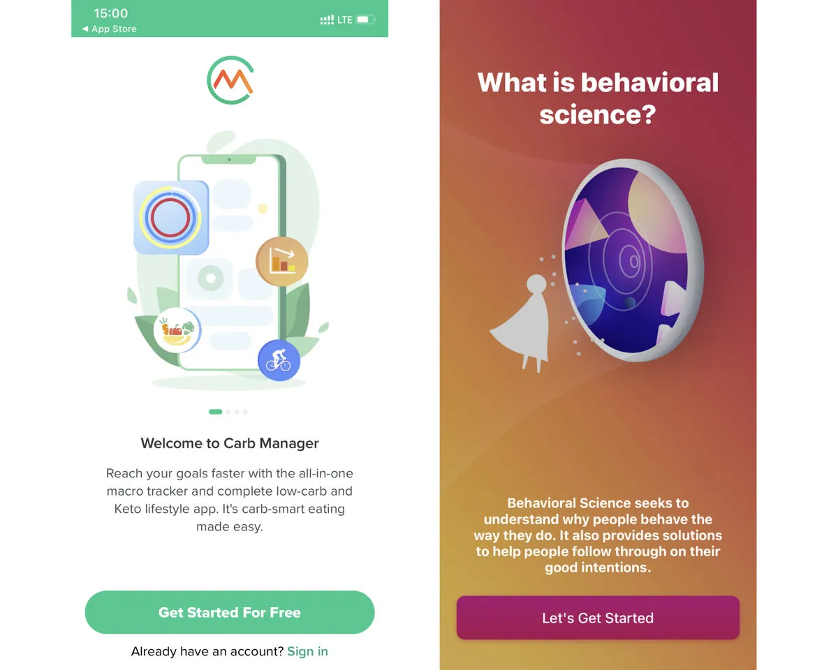
❌ A large amount of text and unreadable fonts increase cognitive load.
1.3. Images and Videos Should Be Large Enough Without Too Many Small Details
💡 Pay special attention to videos and animations. Our brain involuntarily pays great attention to movement. Ensure it does not distract from the message you want to convey to the user.
2. Helping Users Understand the Whole Picture
2.1 Ensure all elements on one screen serve one purpose and help convey your message
💡 Subconsciously, we first pay attention to the image. If it’s unclear how it relates to the text, it complicates the perception of the main point of the screen.
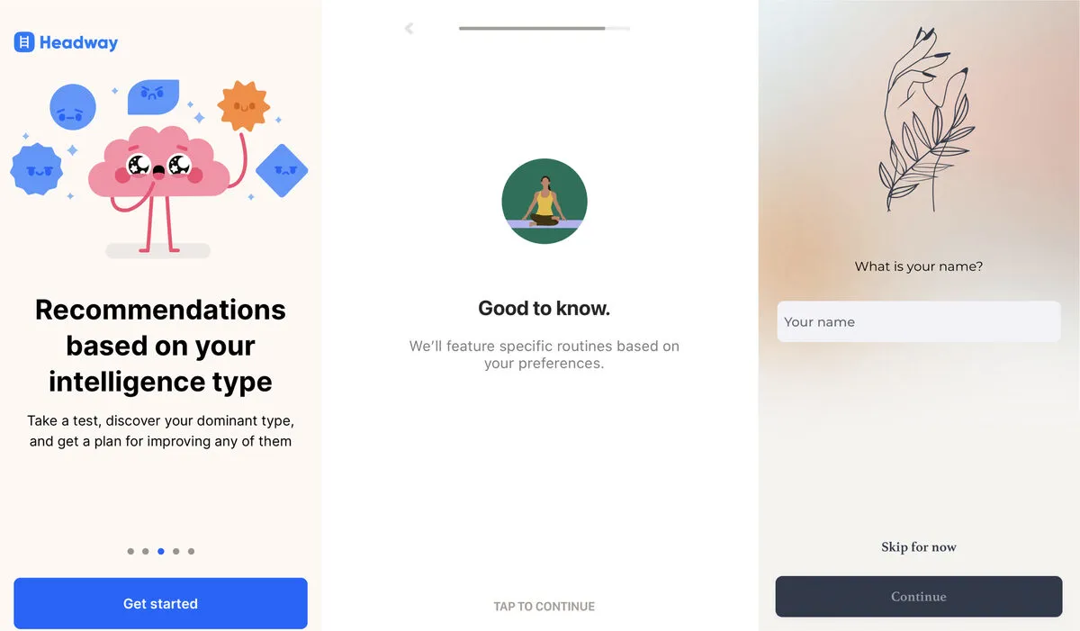
- What is depicted in the picture?
- How are the picture and text related?
2.2 Signaling Principle - help the user focus on information by highlighting important details.
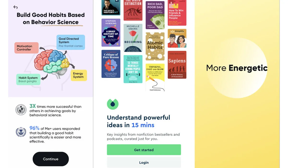
👍 Use arrows or circles around information (the Isolation Effect also helps).
2.3 Space Optimization - place related objects next to each other: picture and text, question and answer, etc. (seems obvious, but examples clarify).
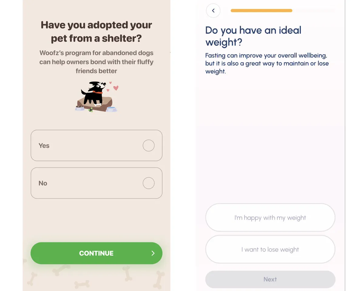
❌ Bad Example: Explanation/picture between question and answer increases the chance the user will forget the question’s essence by the time they reach the answers (question and answers are not perceived as a whole).
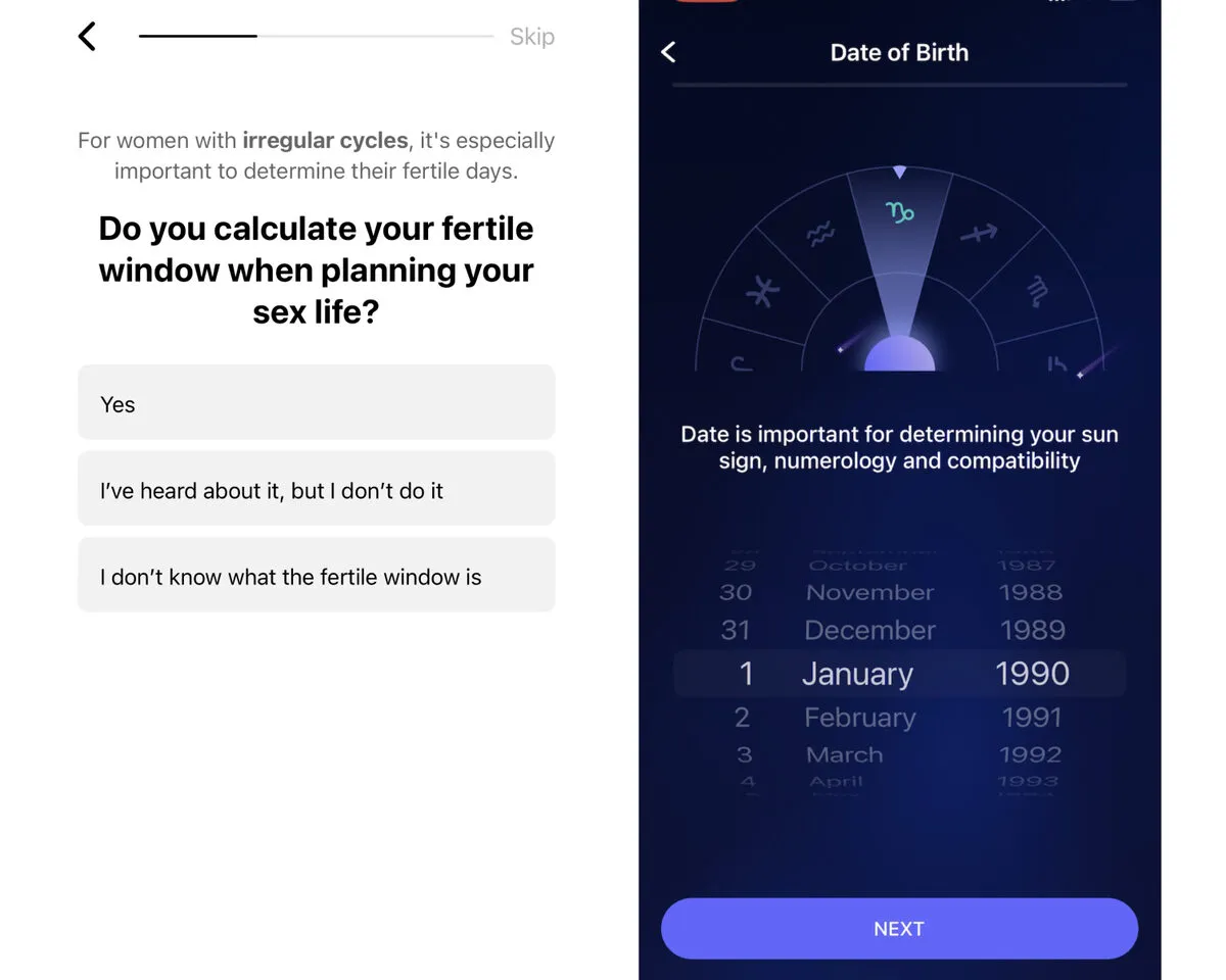
👍 Good Example: When the question is next to the answers, they are perceived as a whole, making it easier to respond.
2.4 Time Optimization - achieved by simultaneously showing related information.
This helps the brain understand WHAT should be perceived as a whole → that’s why animations should be used (not just to look pretty).
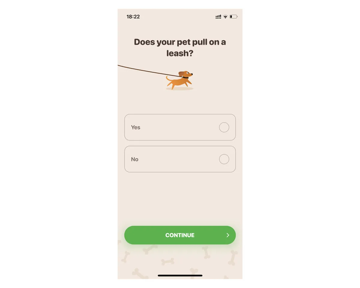
❌ Bad Example: Woofz forces the user to:
1. Select one option in a single-choice list.
2. Click the Next button.
Clicking the Next button is an extra action (considering there are six such screens, cognitive load increases sixfold).
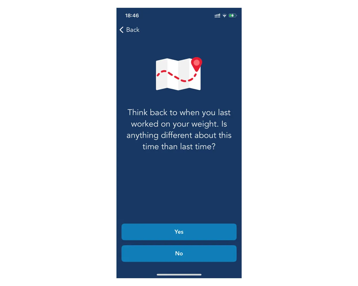
👍 Good Example: In the Lose It! app the user automatically proceeds to the next screen after selecting an option.
Different display or interaction patterns with information (Next buttons, colors, and fonts)
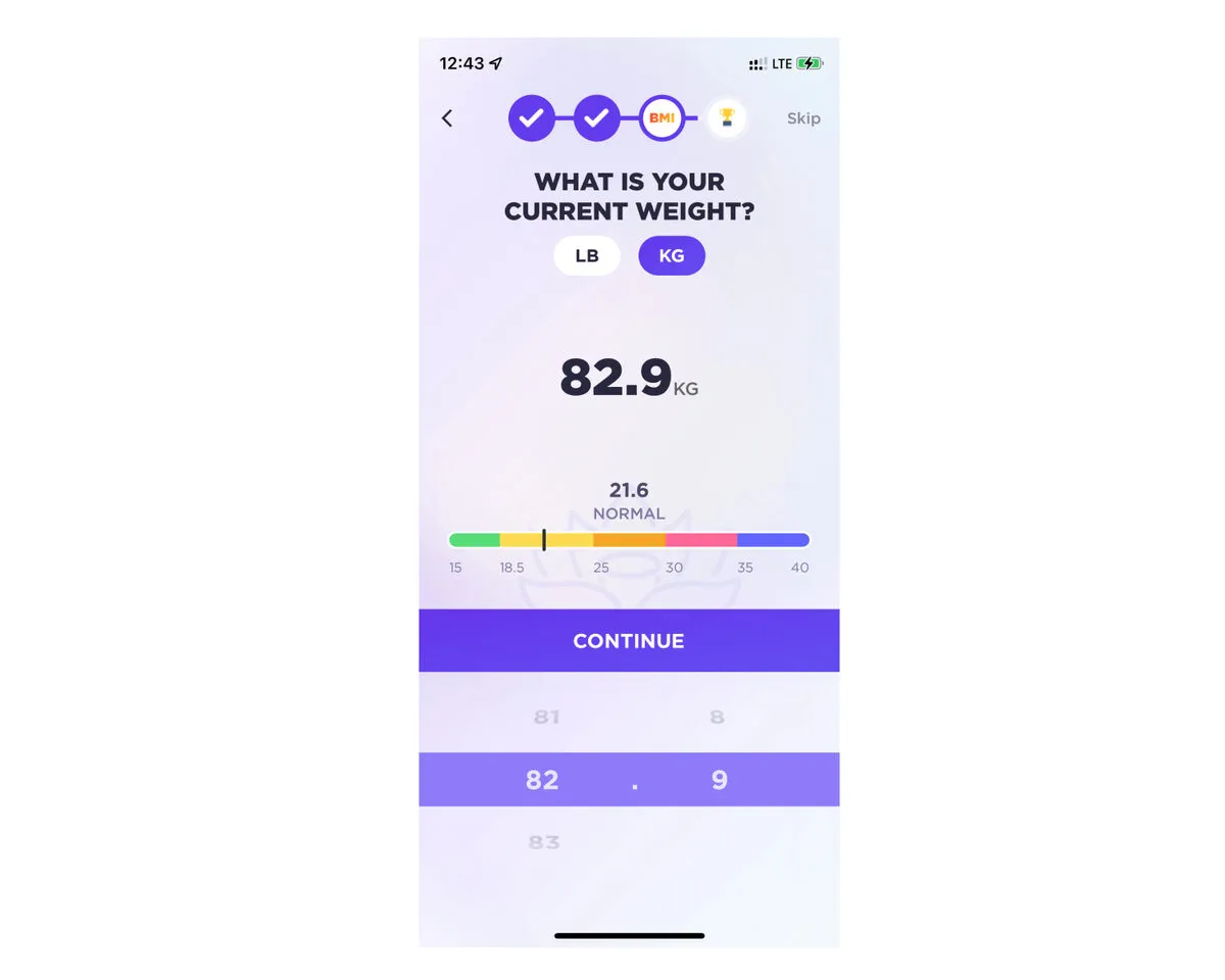
❌ Input method is not intuitive: a picker under the CONTINUE button.
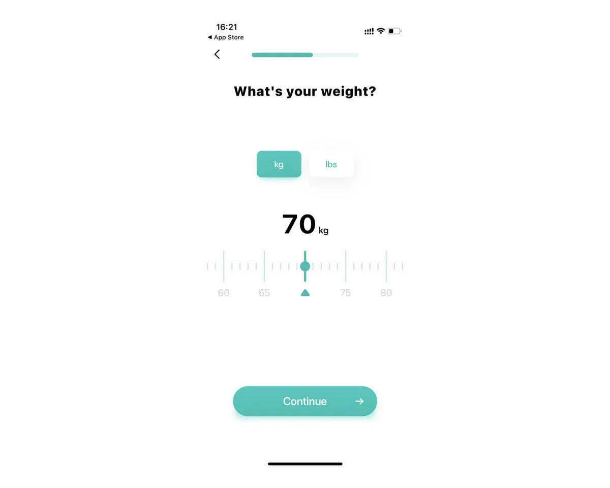
👍 Good Example: Associative patterns reduce cognitive load: the weight entry screen looks like scales.
3. Helping Users Make Decisions and Implement Them
After the user recognizes and understands the information, they must decide whether to invest further efforts.
Users need to:
- Believe that the information received increases their chance of achieving their goal with your product.
- Understand what they need to do next.
- Be able to do it.
3.1 Segmentation - branch the onboarding logic for all significant segments, as it is difficult to choose messages that suit all segments well. People of different ages, genders, and education levels can perceive the same information very differently.
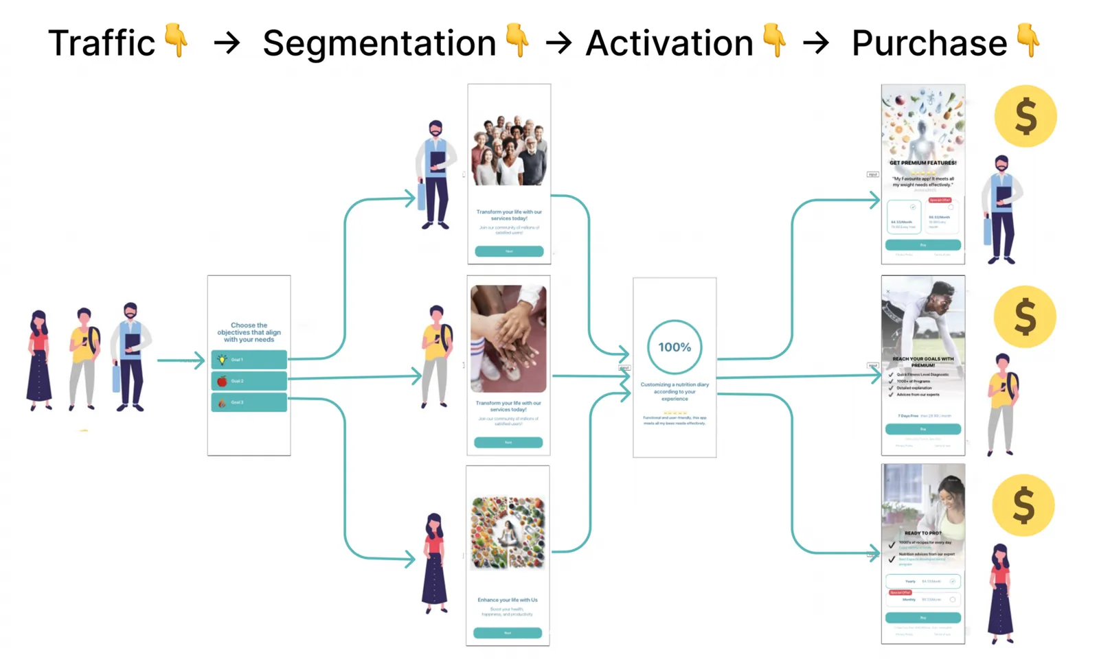
3.2 Use familiar UX patterns for the user, ensuring that elements with the same functions remain consistent throughout the onboarding.
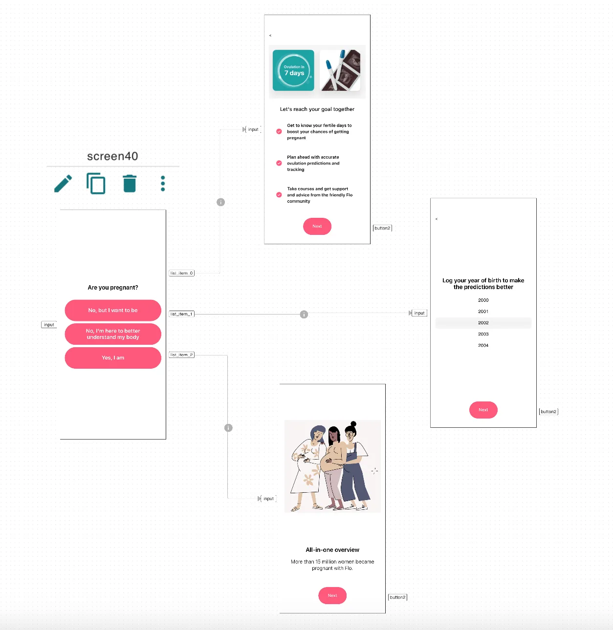
👍 Good Example: Flo clarifies the user’s life circumstances and goals: pregnancy management, self-care, conceiving, and shows relevant information, collects necessary data depending on the user’s choice
P.S. Carefully conserve the user’s cognitive resources until they believe your product is good enough to pay for.
Key takeaways
- People find it hard to process more than 5–7 items at once, so remove unnecessary elements or split an overloaded screen into several.
- Keep text short and easy to read, and make images and videos large, without small details or motion that distracts from the message.
- Every element on a screen should serve one purpose: an image unrelated to the text, or a picture between a question and its answers, adds effort.
- Remove extra actions: Lose It moves to the next screen as soon as an option is selected, while Woofz makes users tap Next on every such screen.
- Branch the onboarding for significant segments and keep UX patterns consistent, because the same message is perceived differently by different people.