Why Properly Combining Images and Text Is Crucial for Onboarding
In short
Text placed below an image works better in onboarding because people read from top to bottom and images catch the eye first. The image-then-text order holds attention, reduces cognitive load and makes the text read as a natural extension of the visual. The image must also match the meaning of the text, or it causes mental strain.
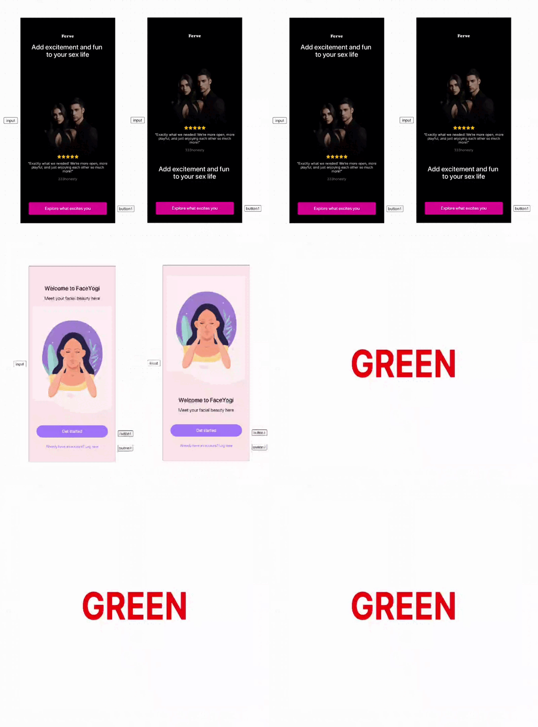
Here’s why placing text below an image is more effective for user engagement and reducing cognitive load during onboarding👇:
- 1. Natural reading flow:
- 💡 People naturally read from top to bottom, making it easier to first process the image and then the text.
- 2. Attention retention:
- 💡 Images grab attention more quickly than text, guiding the eye to the visual content first, then naturally transitioning to the text, improving memory retention.
- 3. Reducing cognitive load:
- 💡 A logical sequence of image followed by text minimizes the need to switch focus between elements, making information easier to digest.
- 4. Contextual alignment:
- 💡 Captions or text under images are perceived as a natural extension of the visual content, allowing for seamless understanding.
🤓 User attention and motivation are limited resources. Try not to waste them—you still have to show them the paywall!
P.S. It's essential that the image aligns with the meaning of the text. This reduces cognitive load and enhances comprehension. When there’s a mismatch, the isolation effect may attract attention, but it also causes mental strain and disrupts understanding.
Key takeaways
- People read from top to bottom, so an image followed by text lets users process the visual first and the words second.
- Images grab attention faster than text, and the natural move from image to text improves memory retention.
- An image-then-text sequence minimizes switching focus between elements, which keeps cognitive load low.
- The image must match the meaning of the text: a mismatch may attract attention, but it causes mental strain and disrupts understanding.
- User attention and motivation are limited resources, so do not spend them before the paywall.