Isolation Effect: How to Control Users’ Attention
In short
The isolation effect makes people notice the item that differs from similar ones first. In onboarding, an accidental difference, such as the only two-line answer in a list, pulls taps and attention, so similar items should look alike. A deliberate difference in width, height, font, color or screen style directs users to what they should notice and remember.
The isolation effect suggests that among similar items, we tend to notice the most unusual one first (based on the difference in color, shape, size, content, etc.).
This natural tendency helped ancient people avoid danger. For example, flattened grass or a strange bush branch could signal the presence of a predator or other threat. Logically, it was necessary to stay cautious! So, on some automatic level, we pay more attention to the differences between similar items.
And in modern times, it’s IMPORTANT to consider this perception feature during onboarding creation:
- Ensure there are no accidental differences between similar items
- Learn to subtly highlight the things you want the user to notice
Let’s look at some examples.
How the isolation effect pushes toward tapping what you need
The more attention we pay to one thing, the less we focus on another.
Say you offer the user a list of answer options. All answers include one line, except for one that consists of two lines. This way, it becomes the most noticeable:
- The user often picks this option only because it is different
- Other options are less noticeable compared to this special one
- Such a list may make a person worried (the brain tries to understand whether there is some danger)
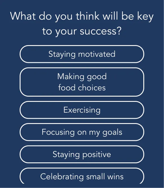
The 2-line option captures the most attention.
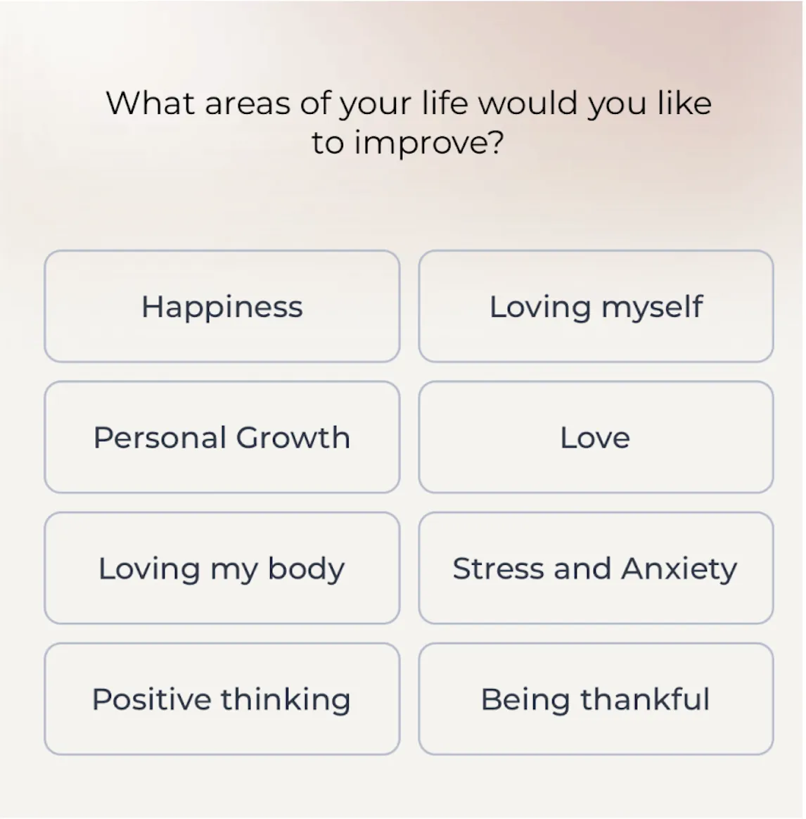
The option with the shortest text stands out from the list.
IMPORTANT: All options should have the same visual form.
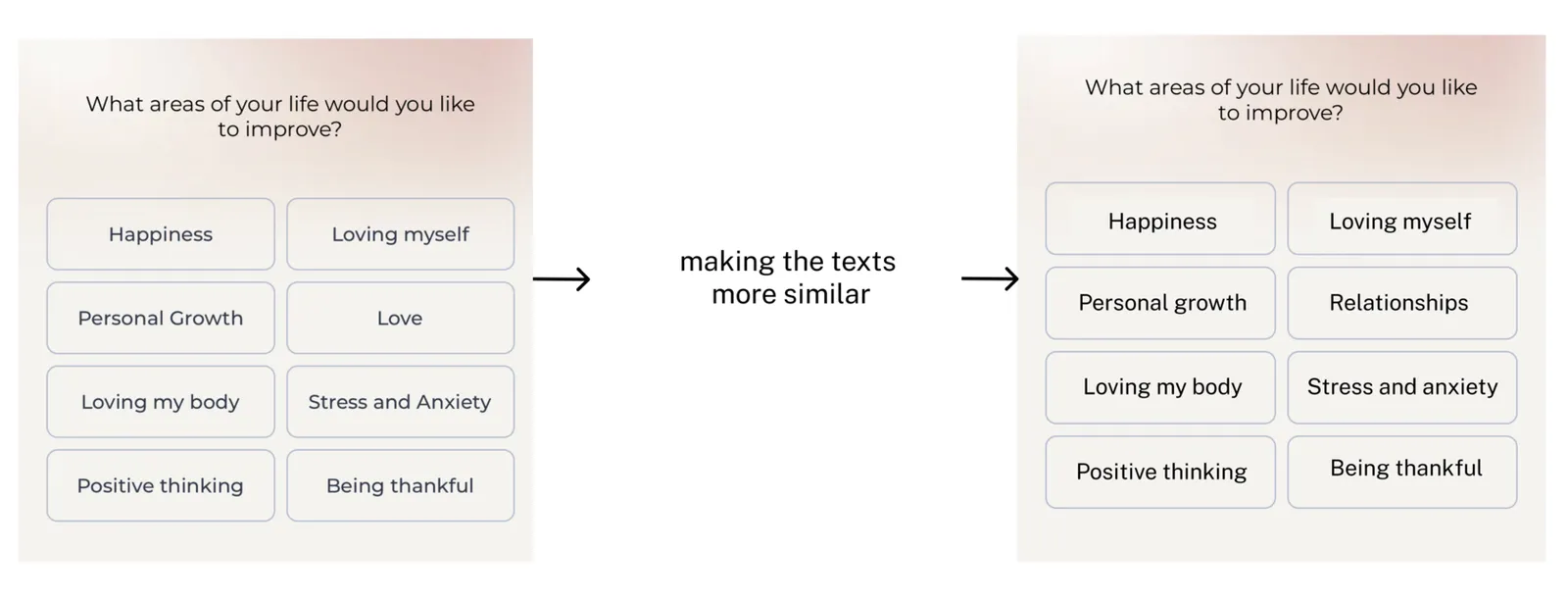
How the isolation effect pushes toward the necessary action
The user will pay more attention to an element that differs in:
- width
- height
- font
- color
You can benefit from the effect by directing user attention to the necessary element.

The Intent app builds the following scheme in the user’s head: “Intent will create a meal plan for you” → in a row of monotypic items, the one that they want the user to remember is highlighted in color.
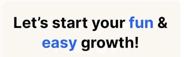
The Headway app wants the user to remember the following: “You can develop yourself in a fun and easy way” → the words “fun” and “easy” are highlighted in color.
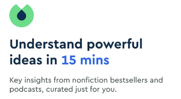
Blinkist believes that their main advantage is that the user will understand a book’s idea in 15 minutes → “15 minutes” is highlighted in color.
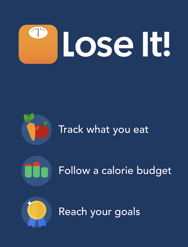
Lose It! wants the user to remember the app name and icon → the name and icon are bigger.
The same works for a sequence of screens
The user will pay more attention to a screen if it’s different from others in:
- size or color of elements
- background
- image
Therefore, the chances that the user will better remember the screen’s content (key messages, meaning, the choice made) are higher.
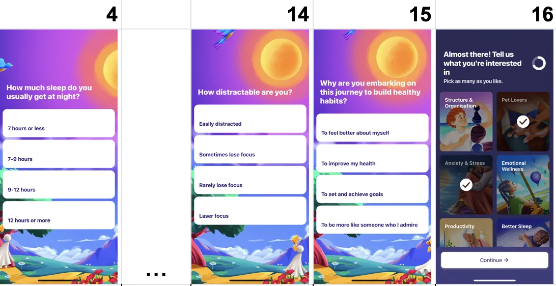
After 11 similar screens, the Fabulous app shows a different one. The screen differs in color, buttons, and UX (multiple choice, ticks on checkboxes, the Continue button). So, the user will remember this screen.
Be careful!
Don't break the general context (the message, visuals, etc.) without any particular goal! This causes additional pressure and increases the risk of distorting the meaning of the entire onboarding under the influence of the priming effects (read this article to learn more about it).
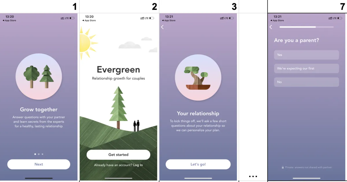
Example 1: It’s hard to understand why the 2nd screen is visually different. Did they want the user to remember the word “Evergreen”?
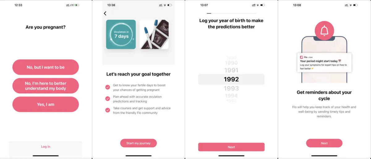
Example 2:
The button for moving further is different on each screen. There is no sensible explanation for this.

Don’t forget to check your UI for the presence of the isolation effect to avoid the unnecessary focus of attention. Taking the priming effect into account, it may significantly influence the whole onboarding process.
The conscious use of the isolation effect will allow you to control your users’ attention. So, feel free to apply it with good intentions.
Key takeaways
- Among similar items, people notice the most unusual one first, a reflex that once helped them spot danger.
- An answer option that stands out, such as the only two-line option or the shortest one, gets picked just because it is different, so all options should share one visual form.
- Highlighting a word or an element through width, height, font or color directs attention to it, as Intent, Headway, Blinkist and Lose It do.
- A screen that differs from the ones before it is remembered better, like the Fabulous screen that follows 11 similar ones.
- Do not break the visual context without a goal: unexplained differences, such as a different button on every screen, add pressure and can distort the meaning of the onboarding.