How a Progress Indicator Can Worsen Onboarding Conversion Rates
In short
A progress indicator adds a sense of control, small rewards and the Zeigarnik pull to finish, but in a long onboarding a bar that barely moves feels endless or broken. Choose by length: a line for a few steps, segments for medium flows, a plan of main blocks for very long ones, and none for 2–4 steps.
The 6 Most Suitable Types of Progress Indicators
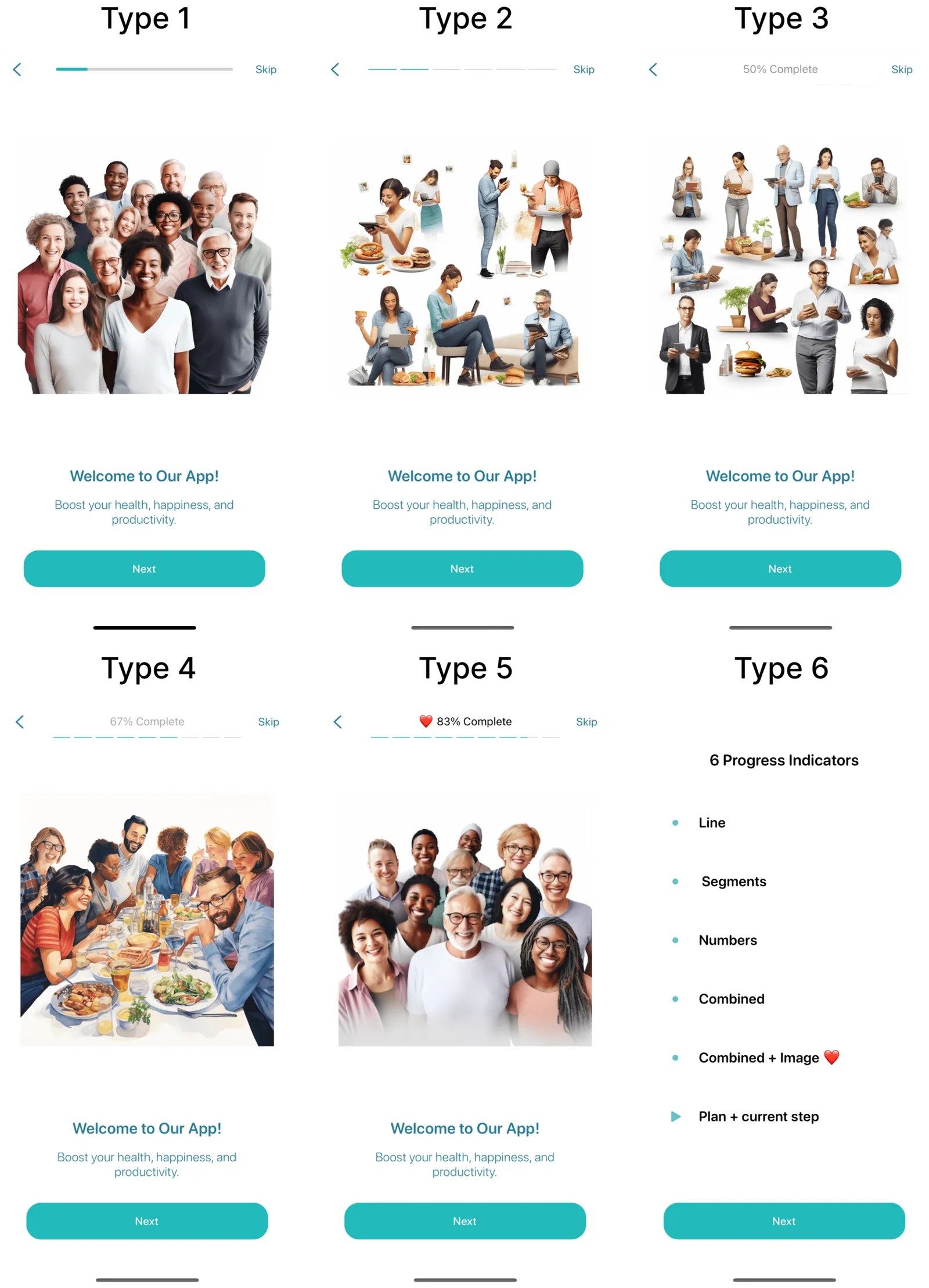
Benefits of a Progress Indicator
- Increases sense of control: Reduces cognitive load and eliminates the uncertainty of when onboarding will end.
- Micro-dopamine stimulation: Segmented progress indicators provide small rewards when a segment is fully completed. 💡 This effect can be enhanced if an interim result or reward is given at the end of a block linked to the segment.
- Zeigarnik effect: This psychological principle pushes users to finish what they started. For this effect to work, consider the initial motivation, user fatigue level, task complexity, etc.
Potential Drawbacks
However, if onboarding has many steps and users struggle to notice progress, it can demotivate them.
- Users may feel the process will never end (Example - Yazio app)

- Users may think the app is malfunctioning, reducing trust.
Choosing the Right Type of Progress Bar
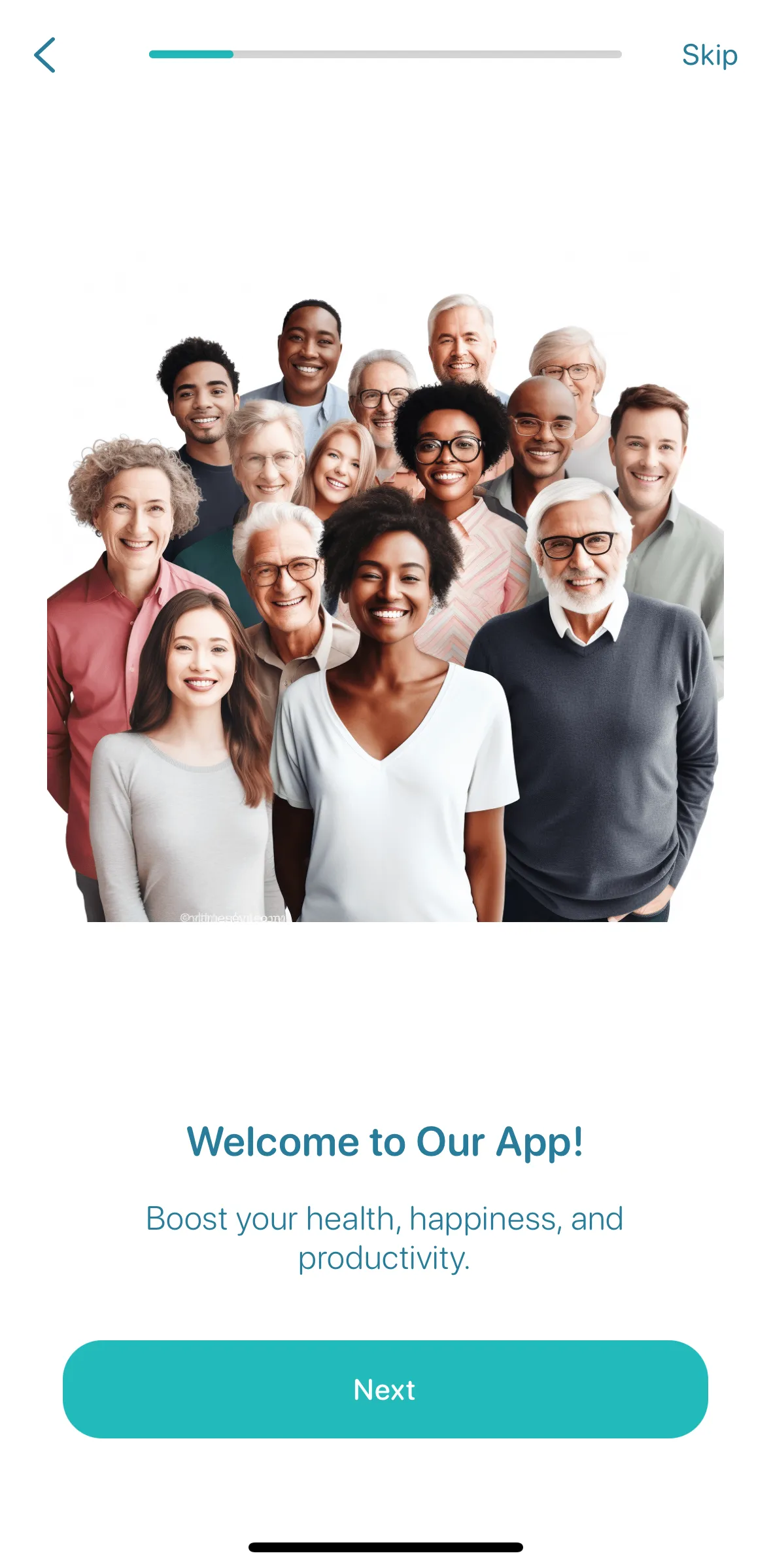
1. Linear Progress Bar:
Suitable for onboarding with few steps, where the visual difference between steps is noticeable.
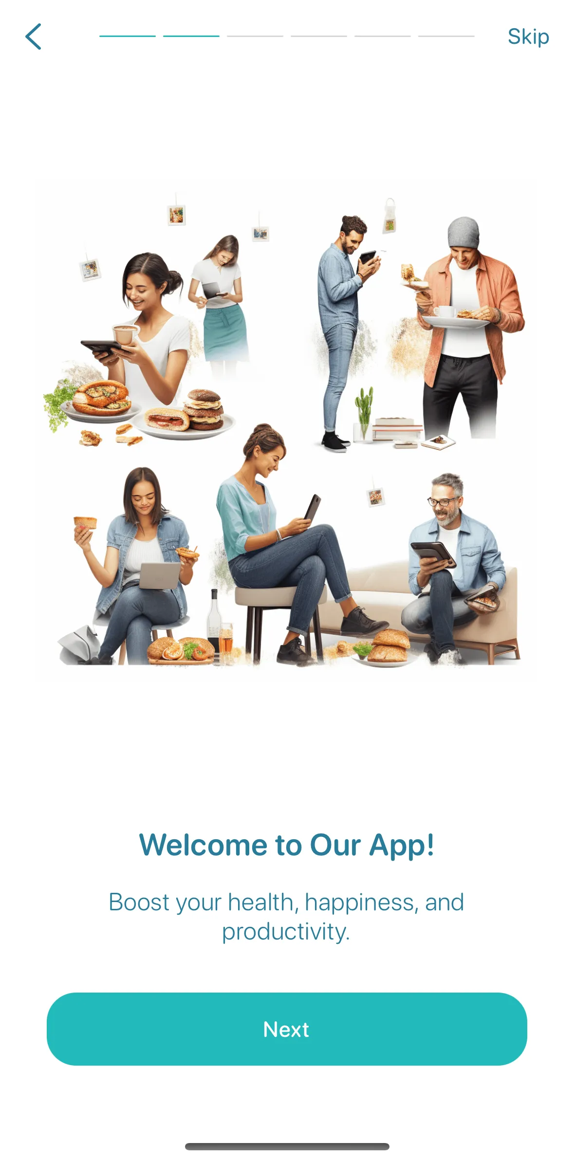
2. Segmented Progress Indicator: Works for medium-sized onboarding processes but be cautious; too many segments can overwhelm users.
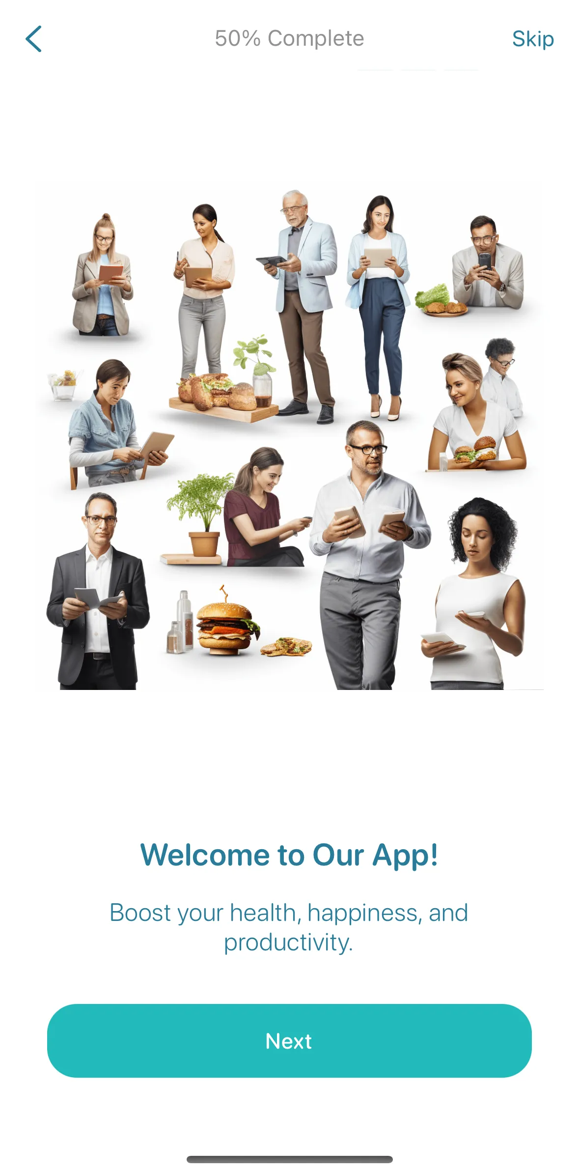
3. Number of Steps or Percentages: Displaying steps or percentages is effective as users only need to remember the progress from the previous step.
4. Combined Linear/Segmented + Numeric: Optimal for onboarding with a moderate number of steps, as it is easy to assess visually.
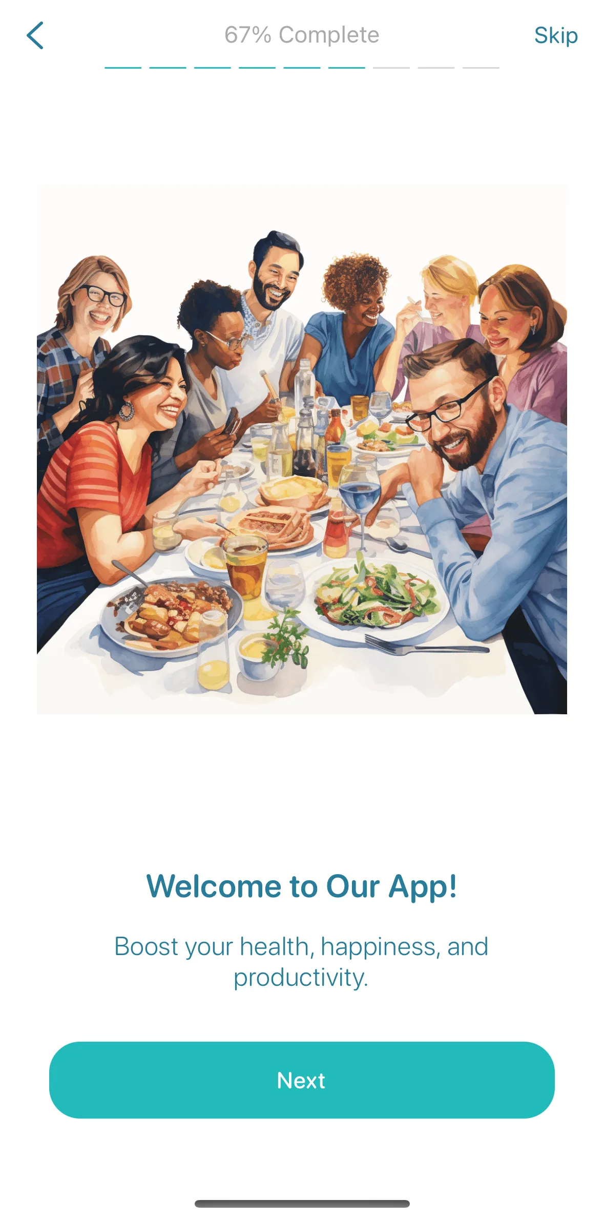
5. Combined Option + Images: Relevant images can increase motivation, as our brain loves novelty and unexpected elements.
💡 Ensure images are relevant, as irrelevant ones can distract and waste valuable attention.

When to Avoid a Progress Indicator
- Short Onboarding: For 2-4 steps, a progress indicator might be unnecessary and could distract from the main content.
- Very Long Onboarding: For 100 steps, if brand recognition or user motivation is low, a progress indicator might cause users to drop out early. 💡 (Use 6th type) In this case, you can show what awaits the user (5-6 main logical blocks). Explain what each block offers the user, and provide some value at the end of each block. A great example of this approach is the Lose It app.
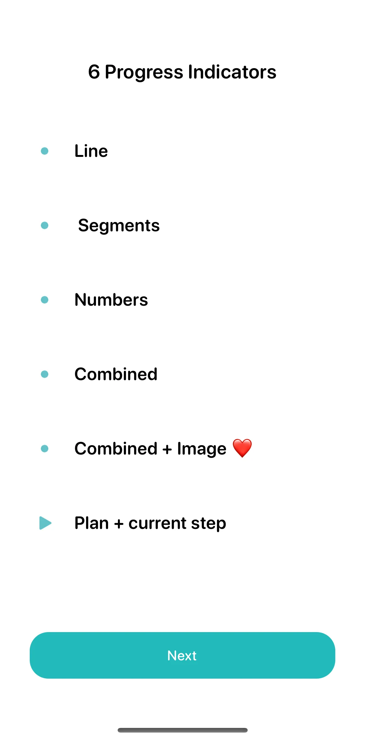
A progress indicator is a powerful tool that needs to be used correctly. Therefore, when designing our service, we made it possible to use all types or opt-out entirely.
Key takeaways
- A progress indicator increases the sense of control, gives small rewards when a segment is completed and uses the Zeigarnik effect to push users to finish.
- When onboarding has many steps and progress is hard to notice, users may feel it will never end or think the app is malfunctioning.
- A linear bar suits a few steps, segments suit medium flows, and steps or percentages work because users only compare with the previous step.
- For 2–4 steps a progress indicator may be unnecessary; for a very long onboarding, show the 5–6 main blocks ahead and give value at the end of each.
- Images next to the indicator raise motivation only when they are relevant; irrelevant ones waste attention.