YAZIO: One of the Best Onboarding Experiences, but There Is Something to Make It Even Better
In short
YAZIO personalizes its 100+ screen onboarding with three goal branches, opens with social proof, returns small value after each block of questions and ends with a four-screen paywall that sells the result by a date. It could still improve its progress indicator, the placement of its fingerprint commitment and the timing of its push notification request.
№ 197 in Health & Fitness, 100+ onboarding screens
👤500k, 💰2M - the past month's info
What you can learn
- Personalized nurturing for main segments (3 main onboarding branches)
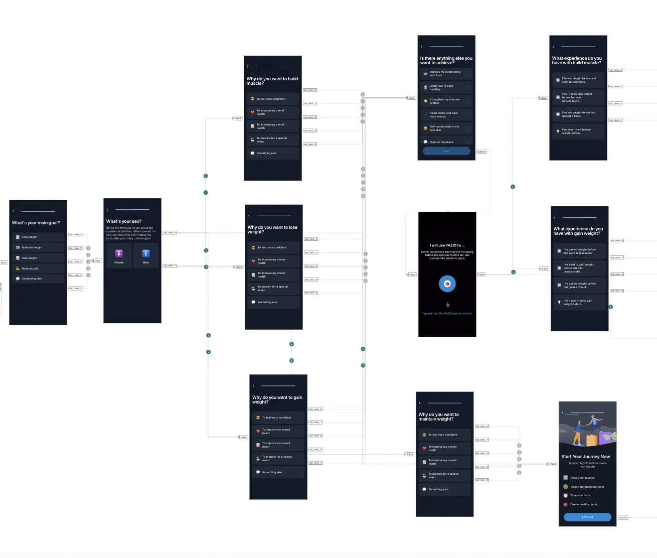
- Starts onboarding with a slider featuring three types of social proof (using the priming effect, subsequent points will be perceived with greater trust)
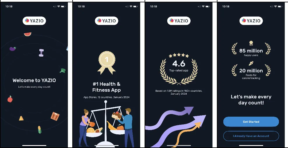
- After the user selects a goal that reflects their need, they enhance the user's motivation through the user's context, previous experience, habits, and expectations of need fulfillment
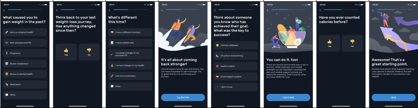
- Clarifies reasons for past failures and explains why it will work with them now
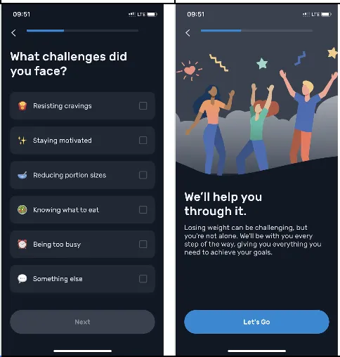
- After each block of questions, which also showcases (advertises) the functionality, they provide a small value (a bit of benefit) already during onboarding
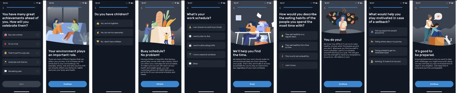
- The entire onboarding feels like a consultation with a good specialist who picks the optimal plan specifically for you
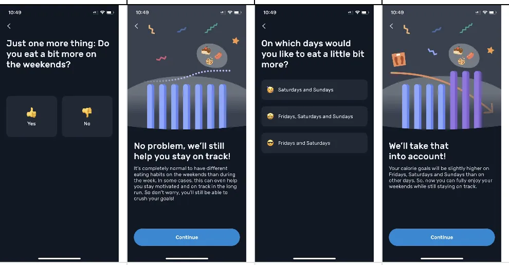
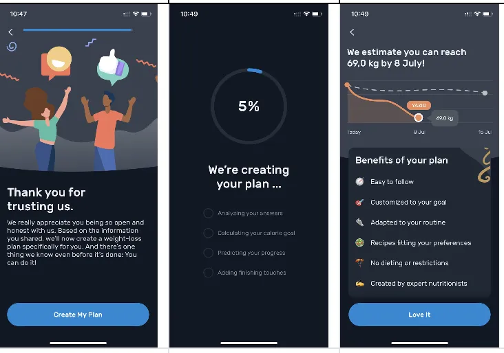
- They use the labor illusion effect to increase the perceived value of the app's work
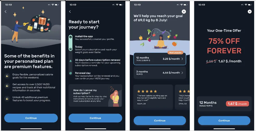
- Excellent paywall block with 4 screens: 1. Show all the benefits of the purchase; 2. Display the entire timeline (when the subscription will happen, when they will notify about it, etc.); 3. A soft paywall that clearly states the result the user wants to achieve and the date when the result will be achieved (they are selling the result!!!!), and there's space for satisfied user reviews; 4. If the paywall is closed, they show another paywall with a 75% discount. It's one of the best paywall blocks I've seen!👆
What can be improved
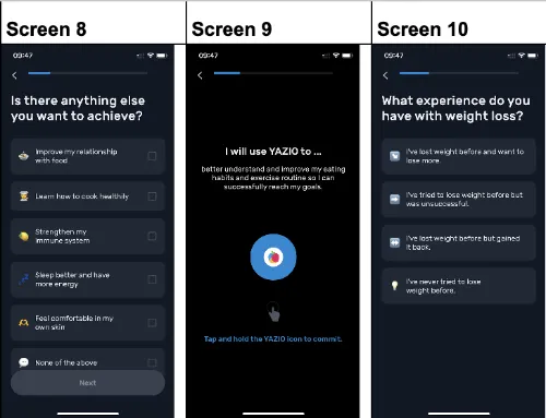
- When the onboarding is long, a linear progress indicator is not very suitable, as it doesn't show progress between adjacent screens well – it can seem like the onboarding will never end

- The feature with commitment through fingerprint is usually used near the end of onboarding, employing the small request effect before asking for a bigger one. (Flo mentioned at the Gurtam meetup that this feature increased their conversion by 5%)
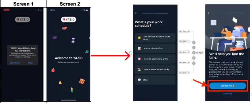
- It might be worth finding a more suitable place for the push notification request (add a separate screen after the question about the user's work schedule – there it will look appropriate), as it worsens the first impression and distracts from social proof on the first screens (priming can also have a negative effect)
You can find the full analysis here.
Key takeaways
- YAZIO nurtures its main segments with three onboarding branches built around the goal the user selects.
- The onboarding opens with a slider of three types of social proof, so later points are perceived with more trust through priming.
- After each block of questions, which also showcases the features, the user gets a small piece of value already during onboarding.
- The four-screen paywall block shows the benefits, the full subscription timeline and the result with a target date, then offers 75% off if the paywall is closed.
- On a 100+ screen onboarding, a linear progress indicator barely moves between adjacent screens and can make the flow feel endless.