Lose It: Motivating Users for Purchase
In short
Lose It keeps users motivated through a 109-screen onboarding. The first screen confirms the App Store promise, 53 screens segment users while 47 lift their motivation, a gradual warm-up comes before data collection, push permission is requested only on screen 103, and sign-up is followed immediately by a paywall with a 7-day trial.
№33 in Health & Fitness, 109 onboarding screens!
Downloads - 100K, Revenue - 2M
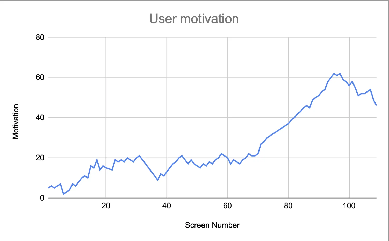
What you can learn
Exemplary Welcome screen #F1:
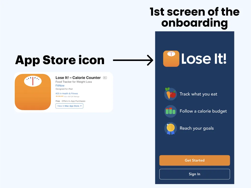
- They promise weight loss on the App Store page → The very 1st screen shows that the user arrives at the right place
- They remind the user why they should go through all 109 onboarding screens → LOSE IT
- They indicate how the weight-loss goal will be achieved: Track what to eat → Follow calorie budget → Reach your goal
- Personalized onboarding → 53 screens with segmentation (#F2)
- Together with the segmentation, they give important information for USERS. This compensates for the motivation spent on choosing the proposed options → 47 screens aimed at lifting users' motivation #F5_1, #F5_2, #F5_3, #F5_4, #F5_5
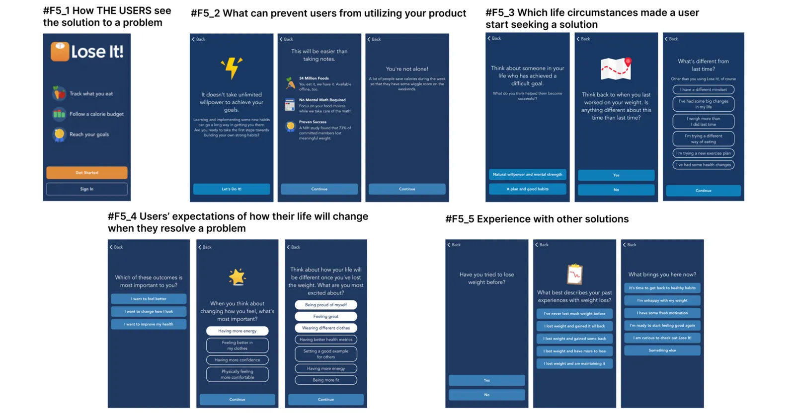
Information tailored to the USER's needs:
- This helps maintain motivation during the selection process → 47 screens boosting motivation (#F5)
Gradual warm-up before data collection: 32 screens!
- They gather essential information to calculate a calorie budget, etc. → 20 screens (#F3)
- The Push Notification request is made only after the FULL warm-up, on screen 103
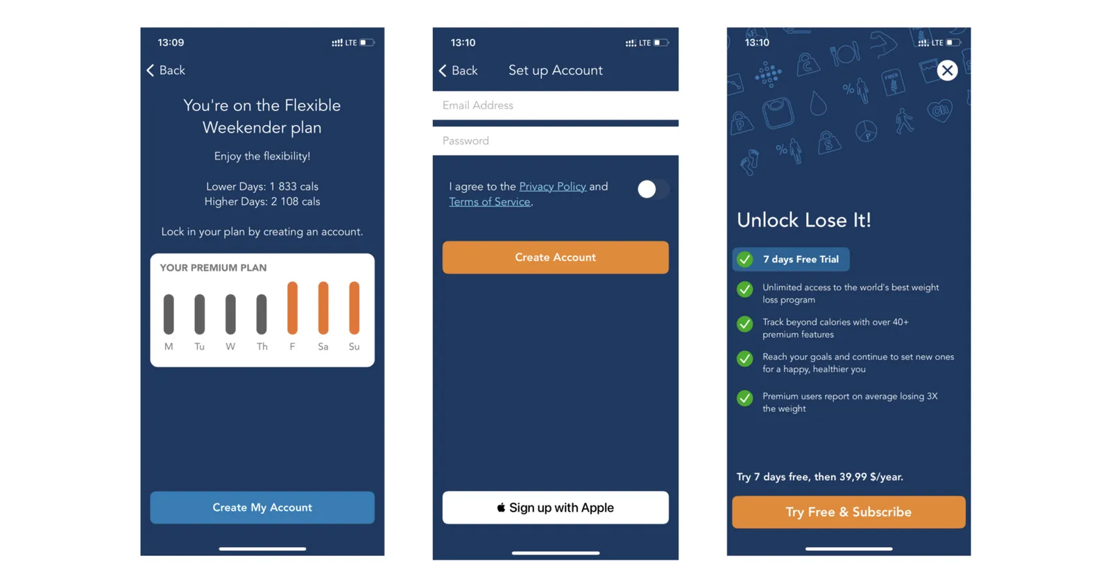
- Pre-Paywall Slimming Plan selection option for product trial (#F6)
Sign-up is shown at the end followed immediately by the paywall.
User segmentation occurs after the warm-up and product trial phase (#F7):
- Accurately offering a 7-day trial
- Allowing users to explore the product without being intrusive
- This serves as a well-designed strategy example!
You can find the full analysis here.
Key takeaways
- The first screen repeats the App Store promise of weight loss and shows how the goal will be reached: track what you eat, follow a calorie budget, reach your goal.
- 53 of the 109 screens segment users, and 47 screens give information tailored to their needs, which compensates for the motivation spent on answering.
- A 32-screen warm-up comes before data collection, and 20 screens then gather what is needed to calculate a calorie budget.
- The push notification request waits until the warm-up is complete, on screen 103, and a plan selection lets users try the product before the paywall.
- Sign-up comes at the end and is followed immediately by the paywall, which offers a 7-day trial.