Priming Effect: Onboarding’s Friend or Enemy?
In short
Priming can be either. The first event shapes how users perceive the next one, because the brain builds one picture from everything it sees. Onboarding can use this to reinforce a message across screens, but an unrelated image, a sudden change of context or a “We won’t spam” promise distorts the meaning and loses users.
The priming effect suggests that if two events go one after another, the first one influences the perception of the second one. The reason is that our brain tries to form a general picture of all events to better understand new info and save energy.
Let’s explore how exactly this effect influences user activity during onboarding.
1. How priming affects information perception on a single screen
1.1 The first text users notice provides a context for the perception of subsequent phrases.
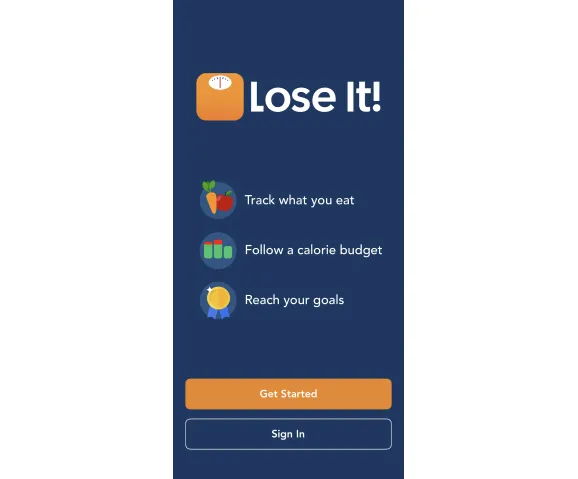
For example, "LOSE IT" → "Track what you eat" → "Follow calorie budget" → "Reach your goals."
1.2 An image contributes to the general understanding of the text (if well chosen).
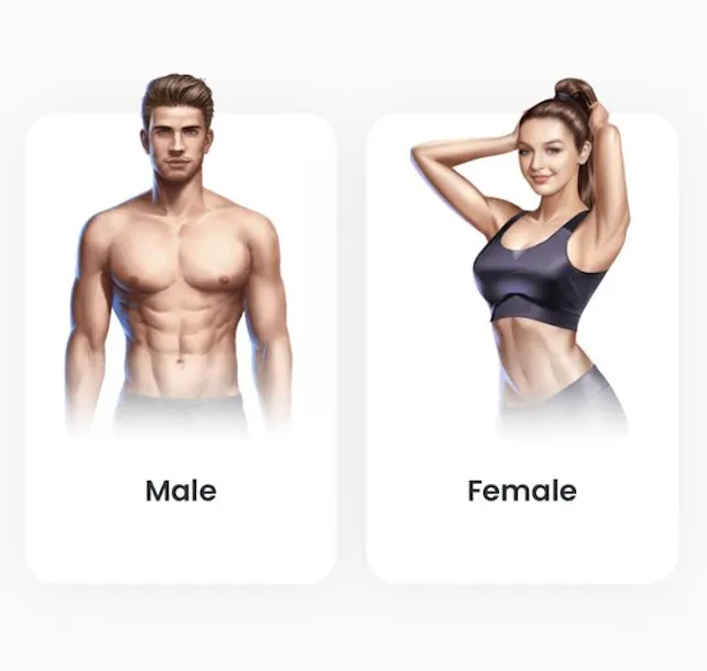
For example, if there is an image, it’s easier to read a text, even if it’s small.
Be careful!
If the image poorly matches the context, it is likely to confuse users (distract them, hinder their understanding, etc.)
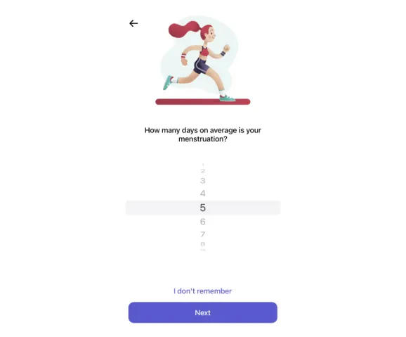
For example, it’s unclear how the image of a running girl is related to the question about menstruation.
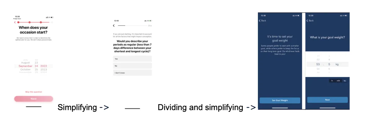
A picture that divides the question and answers complicates the process, as users may simply forget the question.
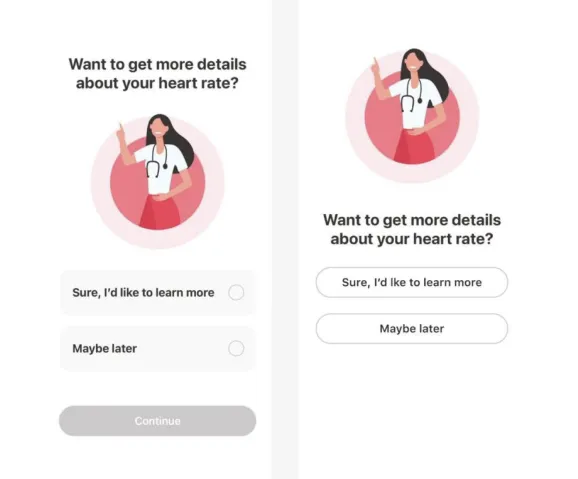
An additional text between the question and answers complicates the process.
2. How priming works on neighboring screens
2.1 You can build the sequence of perception to reinforce the final impression.
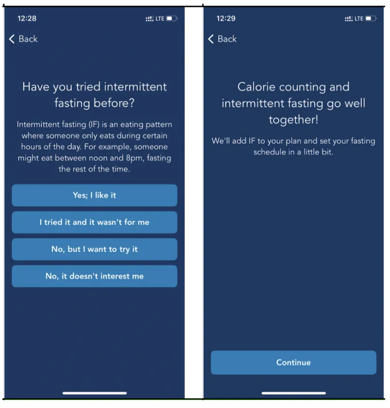
For example, the data from the 1st screen is continued on the 2nd screen:
"Have you tried intermittent fasting before?" → "YES" → "Calorie counting and intermittent fasting go well together! We'll add IF to your plan!"→...
Be careful!
Ensure that priming doesn’t have an unplanned impact.
It can accidentally distort the meaning of unrelated statements.
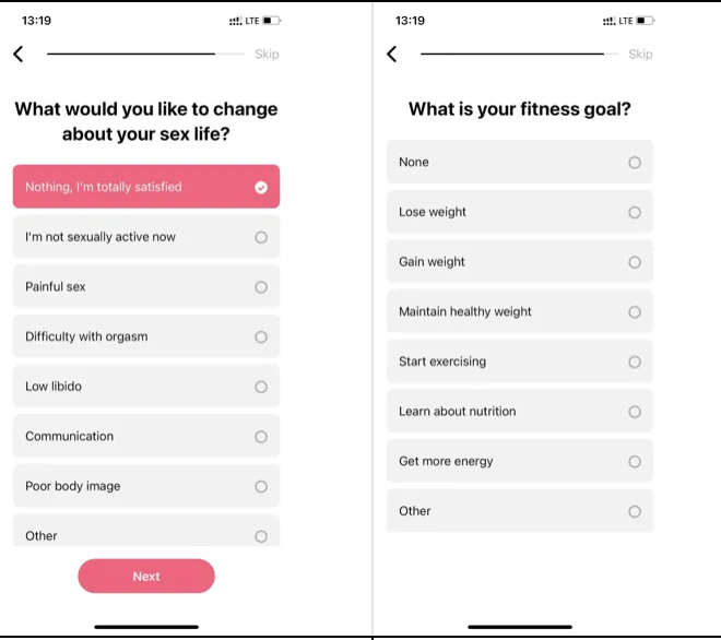
For example, the abrupt shift from sex life to fitness goals may be confusing.
It can create the impression of an unexpected and sudden change of context (related to general meaning, visuals, etc.)
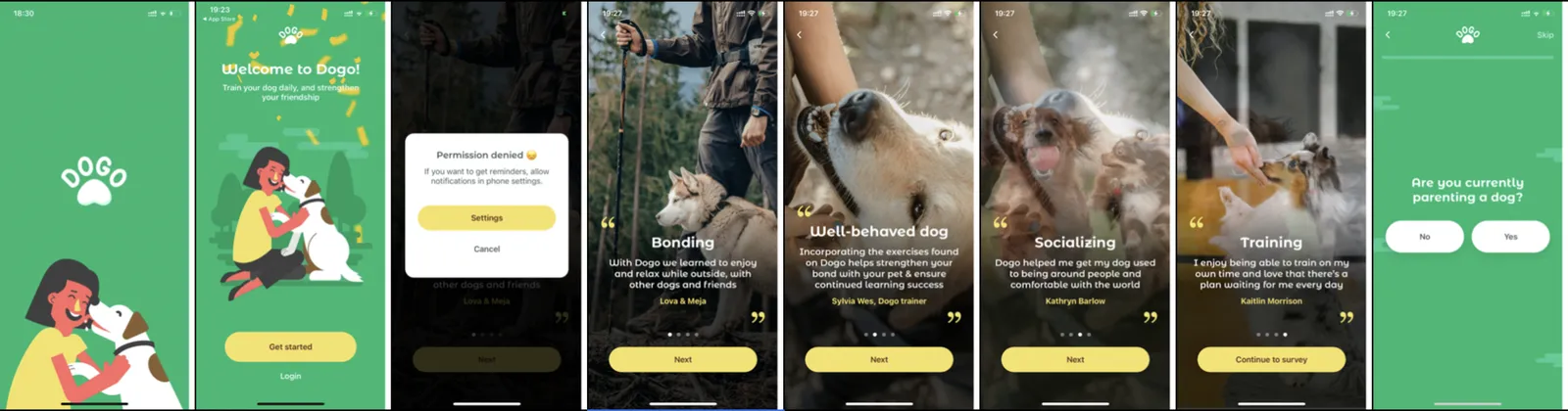
For example, the Dogo app team “borrowed” an idea from competitors and forgot to adapt it to their visuals.
3. Negative priming
Imagine a cleaner entering your hotel room and saying she won’t steal anything. What’s the first thought that comes to your mind? Most likely, you’ll start thinking that she is the greatest thief of all time!
For example,
- “We won’t spam” is often perceived as “We will definitely spam!”
- “We won’t share your personal data” → “We will definitely share it!”
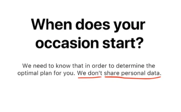
To avoid the reverse priming effect, pay particular attention to the first app screens
The user has seen the advertising banner → has seen the App Store page → and expects to see the logical follow-up in the app itself.
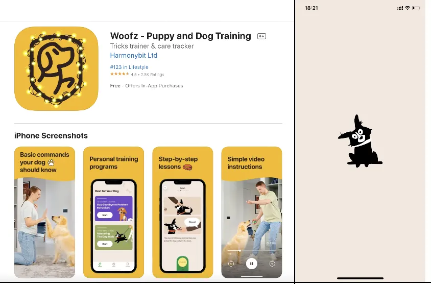
If there is no logical and visual connection, the chances of a drop in user numbers are huge. That’s why #F1 (the 1st onboarding function — to confirm that the app content corresponds to the App Store description) is important. (The article about the functions of onboarding is here)
“The cherry on the cake” is to require access to sending push notifications on the very 1st screen, without explaining why the user needs it. Of course, the drop in user numbers is inevitable in this case!
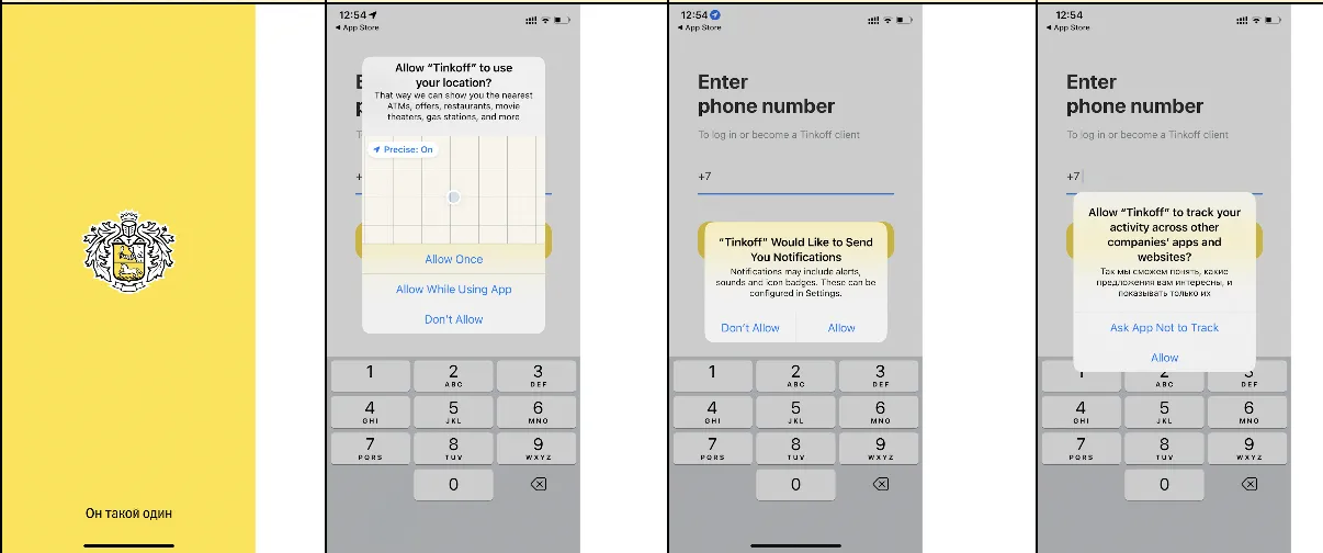
What's better than one request for a push? Right! Three requests in a row!
Remember!
We unconsciously transfer the context from the previous action. And even when we realize it, we can do nothing with it.
Key takeaways
- The first text users notice sets the context for the phrases that follow, and a well-chosen image makes even small text easier to read.
- An image that does not match the question, or a picture or extra text between the question and its answers, makes the screen harder to process.
- Data from one screen can continue on the next to reinforce the final impression, as the intermittent fasting example shows.
- Negative priming turns reassurances such as “We won’t spam” or “We won’t share your personal data” into the opposite message.
- The first screens must follow logically from the ad and the App Store page; asking for push access on the very first screen without explanation drives users away.