Labor Illusion: How Not to Lose Product Value
In short
The Labor Illusion effect means people value a result more when they see the time and effort spent on it. Before the purchase offer, show the steps your product takes to build the user’s personalized plan, keep the wait under 30 seconds, display progress, and speed the loader up toward the end instead of showing a bare spinner.
The essence of the Labor Illusion effect: if something happens quickly and without visible effort, it “seems” less valuable, less high-quality, etc.
Research has shown that people value work more if they understand that significant time and effort were spent on its completion.
For example, home buyers were divided into two groups:
- The first group was told that the real estate agent spent 9 hours selecting 10 options.
- The second group was told that the agent found 10 homes in 30 minutes using a special program.
Both groups were shown the same houses → participants who believed the search took 9 hours rated the houses 36% higher.
Often, buyers value effort more than speed.
- Users want to feel that they are paying a fair price. If something happens too quickly, they may feel cheated. “They did it in 1 second and are asking for $50 → unfair!”
- They are curious about how you do “your job” (Gap Theory. More on this later)
- They value the product more if they believe it performs a significant and complex task → “it's worth paying for!”
- 💡 If you offer a purchase right after onboarding, it is important to demonstrate the efforts spent on the work.
- 💡 This helps explain why the price for your service is fair → increasing the likelihood of a purchase!
How to use Labor Illusion to increase conversion after onboarding
- Clarify with the user what you can help with (their tasks).
- Show the process of preparing the product, considering their needs.
- Highlight all the work you do
- Ensure it doesn't seem instantaneous (what are they paying for then?).
This way, the user will find it easier to part with their money.
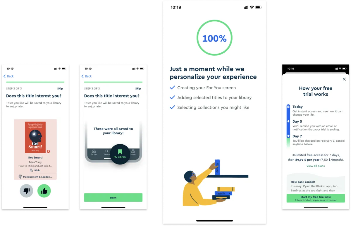
💡 Example, Blinkist app: shows the processing of user data (their goals, book preferences) to create a personalized plan.
Be careful: if the user does not understand the meaning of the loading or processing, it may confuse and repel them more than help.
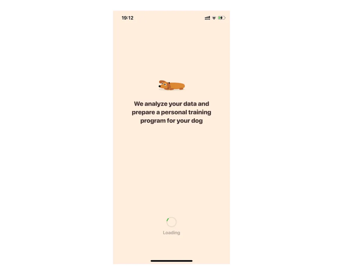
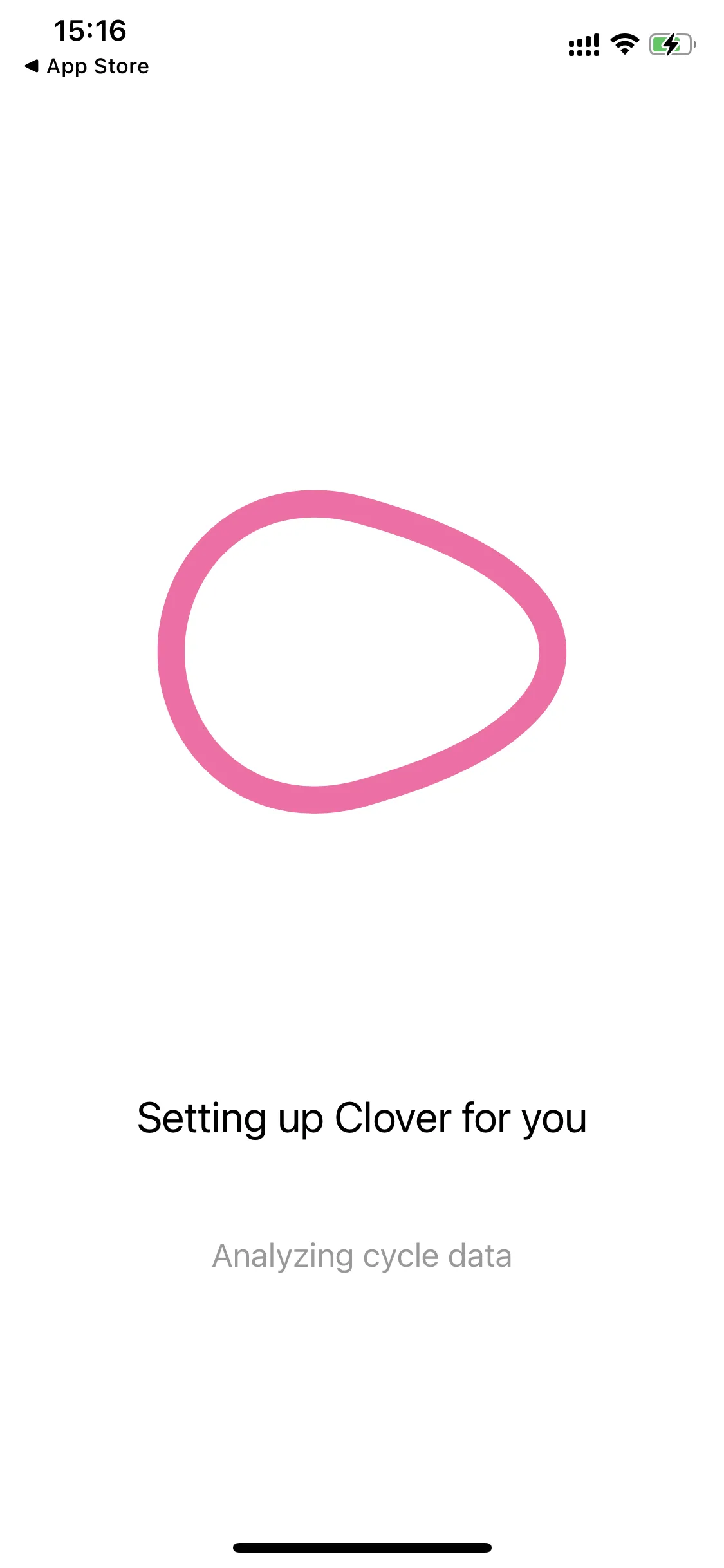
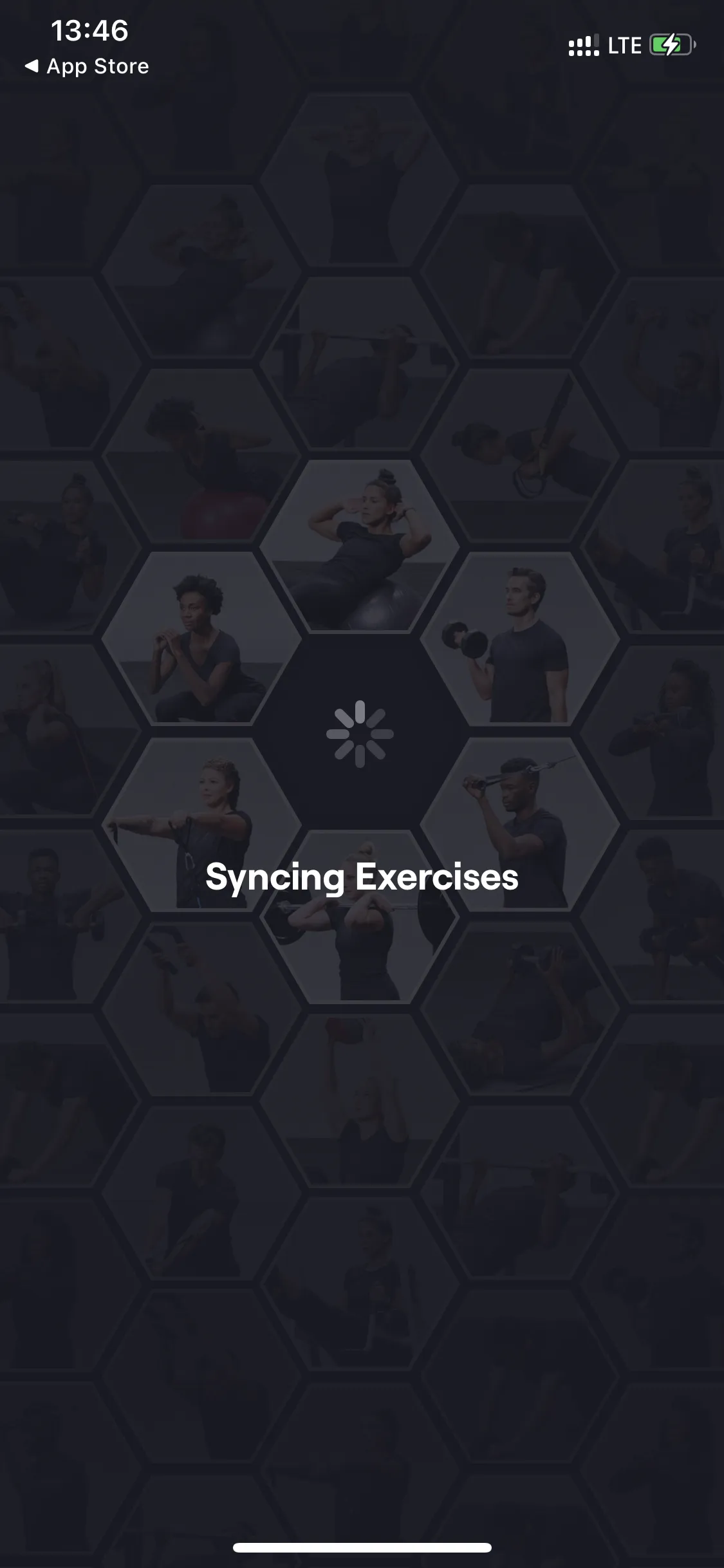
❌ When the progress indicator (Loading) does not show the loading status:
- It is unclear how long to wait; it may seem like the process has “frozen”.
- The text is not detailed enough and does not reflect the stages of work.
There is neither a loading indicator nor explanations of how long to wait → create tension (what if the app is frozen), rather than increasing trust.
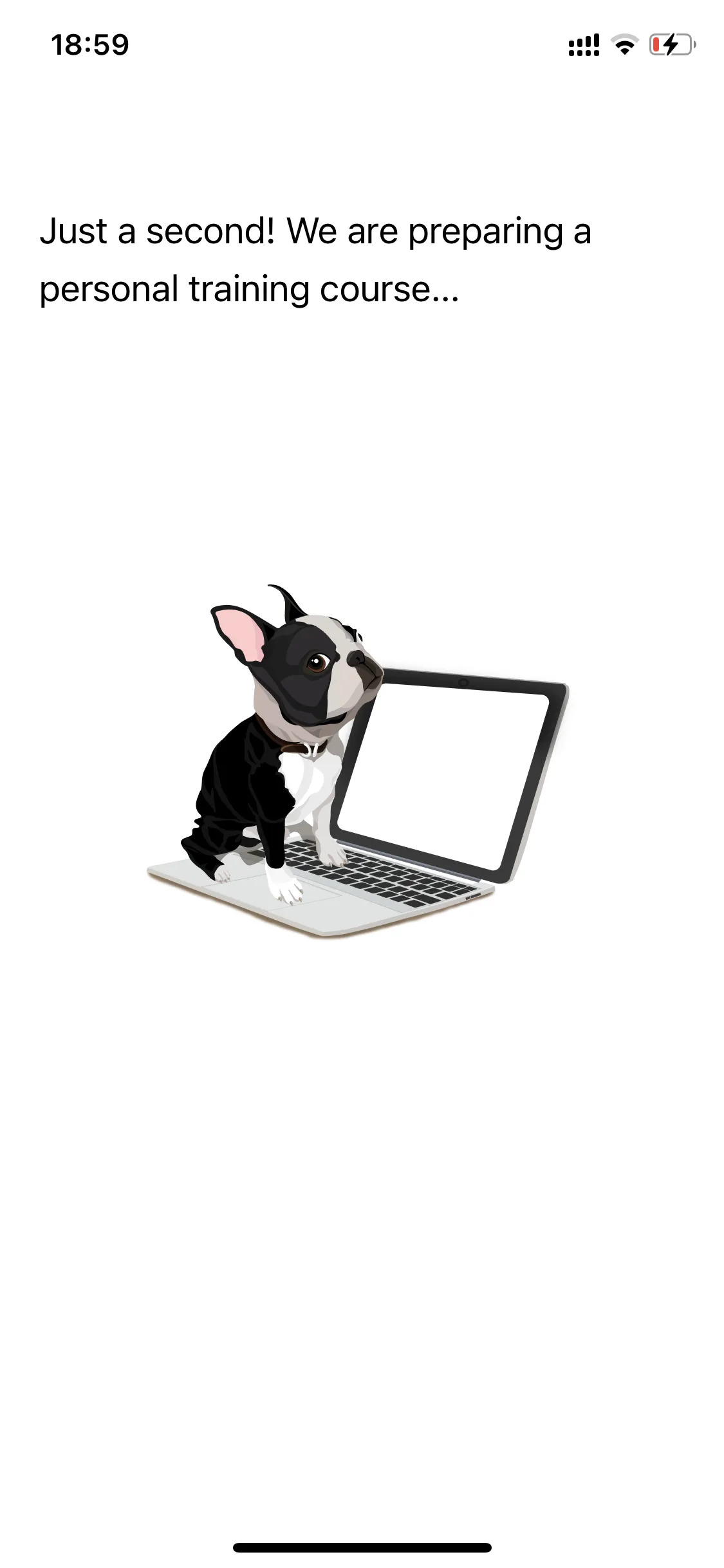
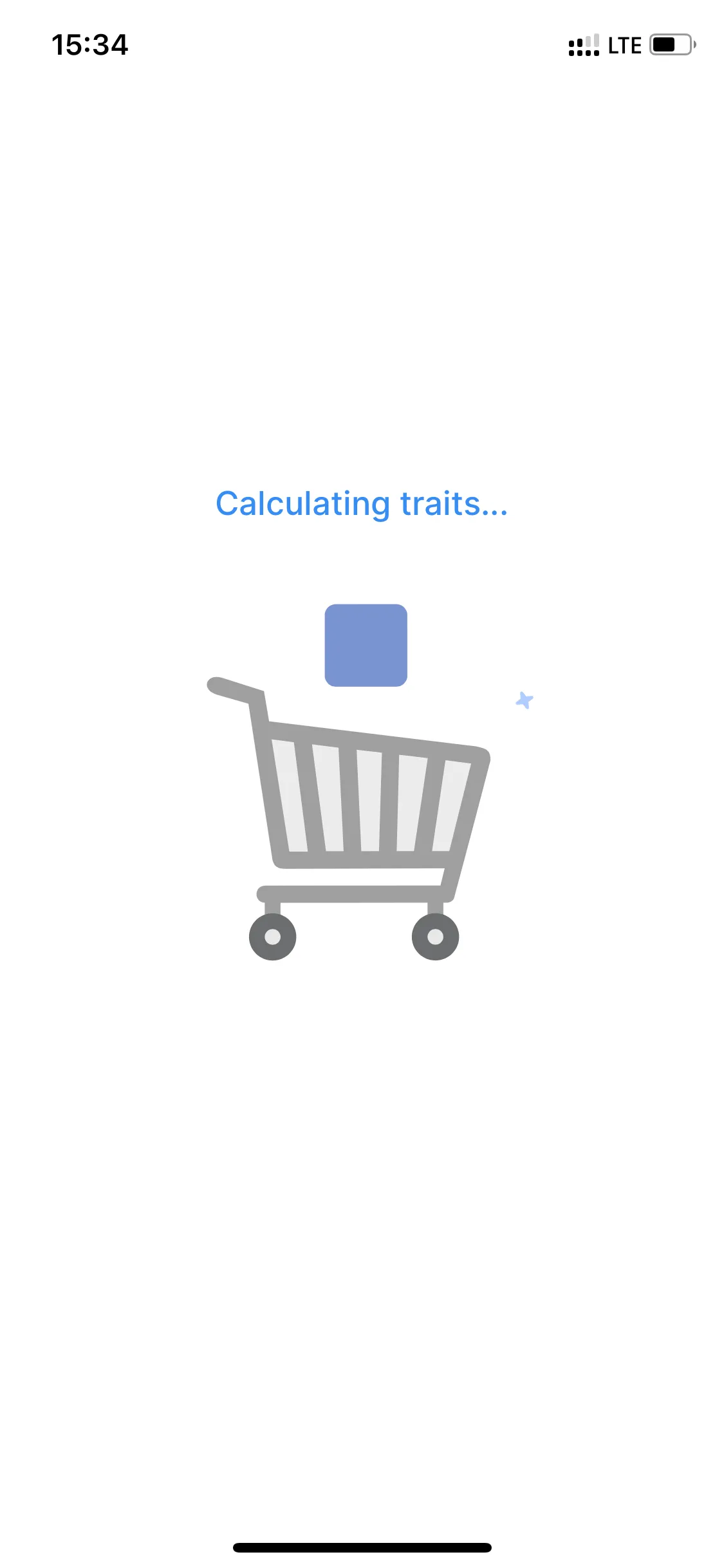
What to consider when using the effect:
- Do not make the user wait more than 30 seconds; it may be perceived as a failure or error.
- Simply showing a progress bar is not enough to convey the product's value. Show the work happening “behind the scenes” using words, numbers, pictures, animations.
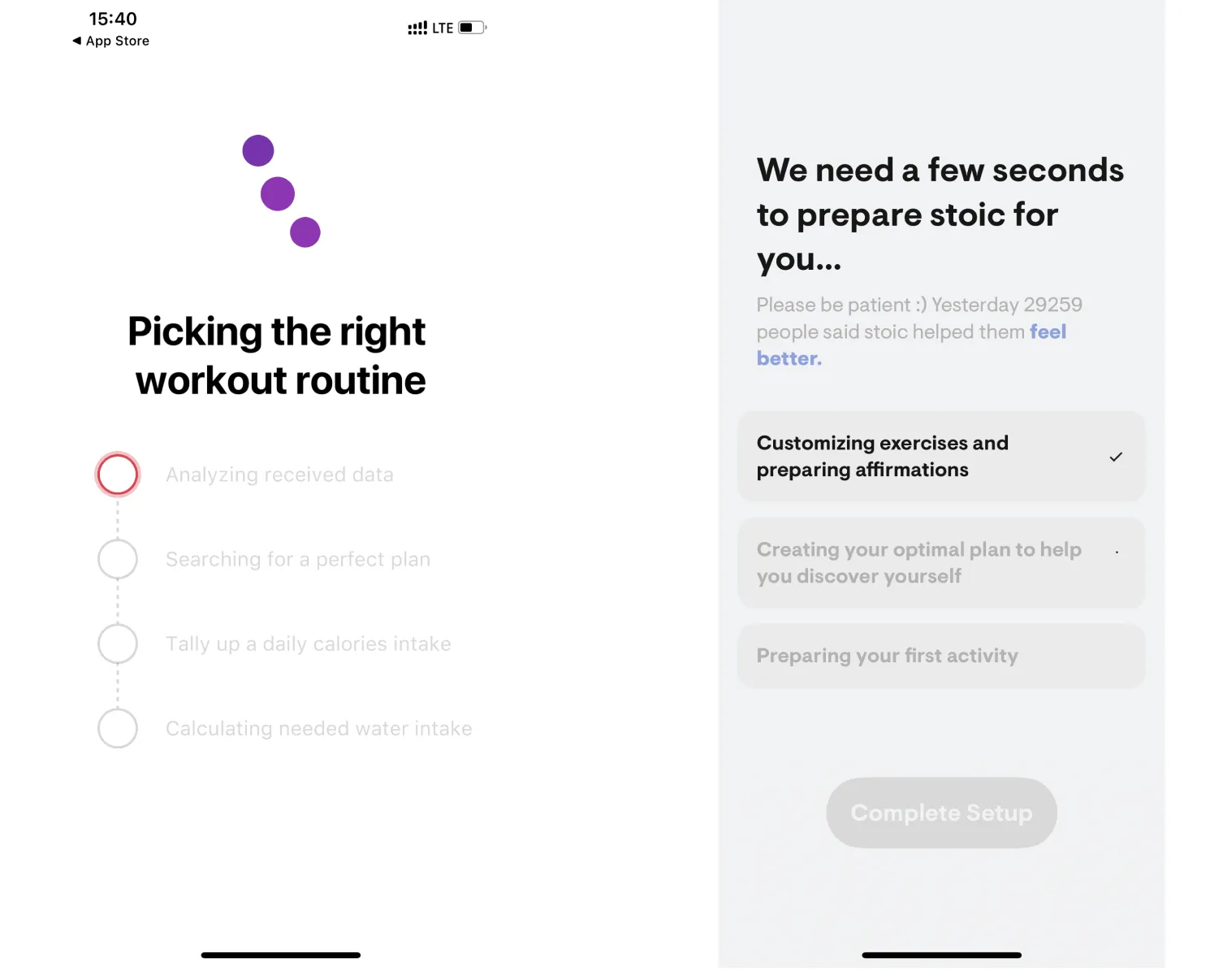
💡 Weight Loss Running by Slimkit and stoic show the sequence of steps they take “behind the scenes” when forming a personalized plan.
Techniques for Improving Perception of Progress Indicators
- 1. Speed up the loading progress closer to completion. Users are willing to wait longer at the start of loading.
- 0-30% - 5 seconds,
- 30-60% - 3 seconds,
- 60-100% - 2 seconds.
Remember your emotions when the loading freezes at 99%. Is it worth making the user nervous before asking them for money? 😉
2. Avoid using a “loading indicator” (spinning circle) without numbers or a filling bar; it does not show the time until completion → uncertainty makes people nervous.
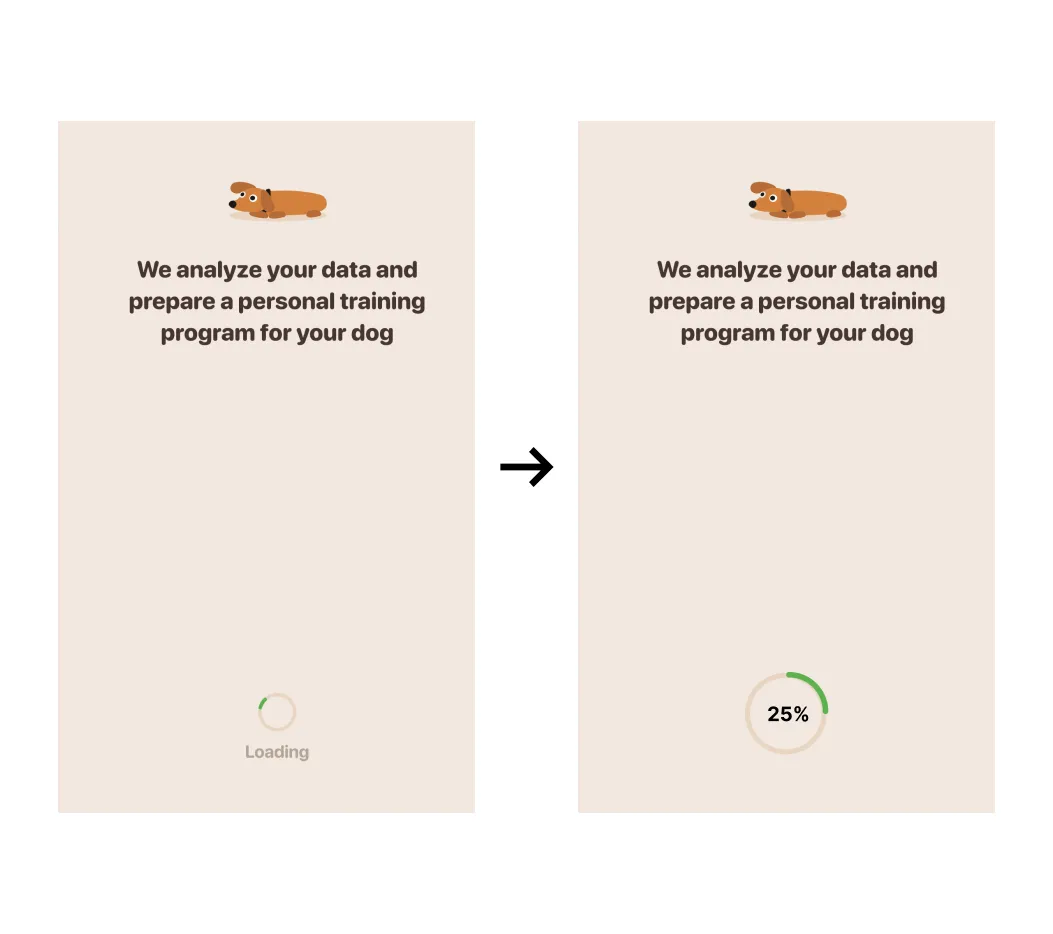
3. For a loading indicator with animated diagonal stripes, the movement of the stripes from right to left reduces the perception of waiting time.
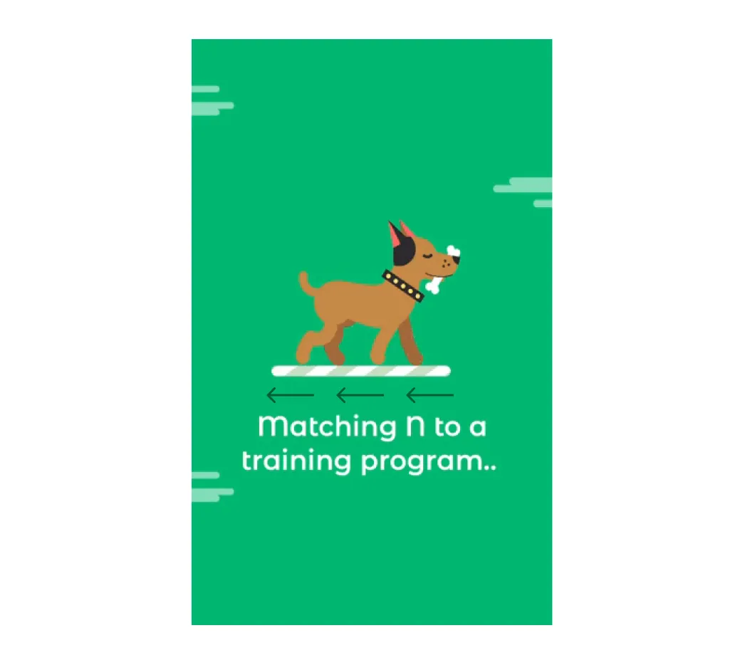
4. Animations should be smooth (rendered at 60 frames per second).
A slight delay before providing the result and illustrating the work done by the product significantly affects the perception of its “value” → fairness of the price → conversion to purchase.
However:
- Do not make the user wait too long.
- Do not forget to display progress.
- Show the stages of the work done by the product.
Key takeaways
- People value work more when they see the effort behind it: buyers who believed a home search took 9 hours rated the same houses 36% higher.
- Before the purchase offer, show the steps your product takes to build the user’s personalized plan, so the price feels fair.
- A spinner without progress or explanation creates tension instead of trust.
- Keep the wait under 30 seconds and speed progress up toward the end: 5 seconds for 0–30%, 3 for 30–60% and 2 for 60–100%.
- Stripes that move from right to left and smooth 60 fps animation make the wait feel shorter.