Dancefitme: Key Takeaways for Your App’s Onboarding
In short
Dancefitme’s onboarding shows users they are in the right place, demonstrates value with dance videos and social proof, asks what motivates them, shares intermediate results like BMI and a weight graph, then shows how dancing reaches the goal before a strong paywall. Its UI adds cognitive load through a heavy progress header and inconsistent Continue buttons.
#37 in Health & Fitness, ~25 onboarding screens
👤 200K, 💰600K
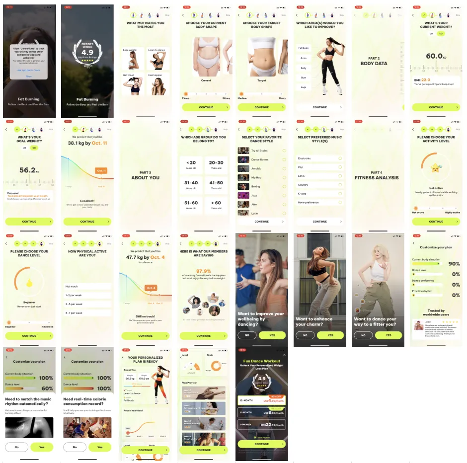
What can we learn from them
- 1. The launch screen with the icon and slogan shows that you're in the right place.
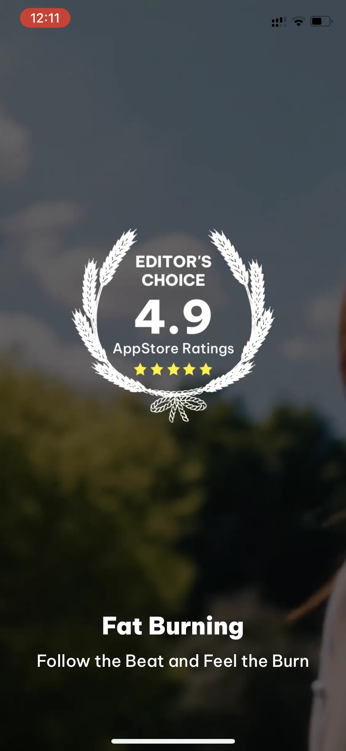
2. The first screen clearly demonstrates how to get value:
- Dance videos
- Text: “Fat Burning → Follow the Beat and Feel the Burn”
- Two types of social proof enhance the effect
3. They clarify what motivates the user to use the app (the list of answers highlights the benefits):
- Lose weight
- Learn to dance
- Stay toned
- Feel happier
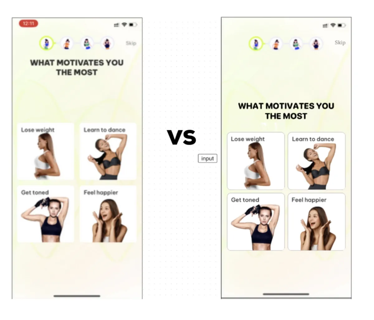
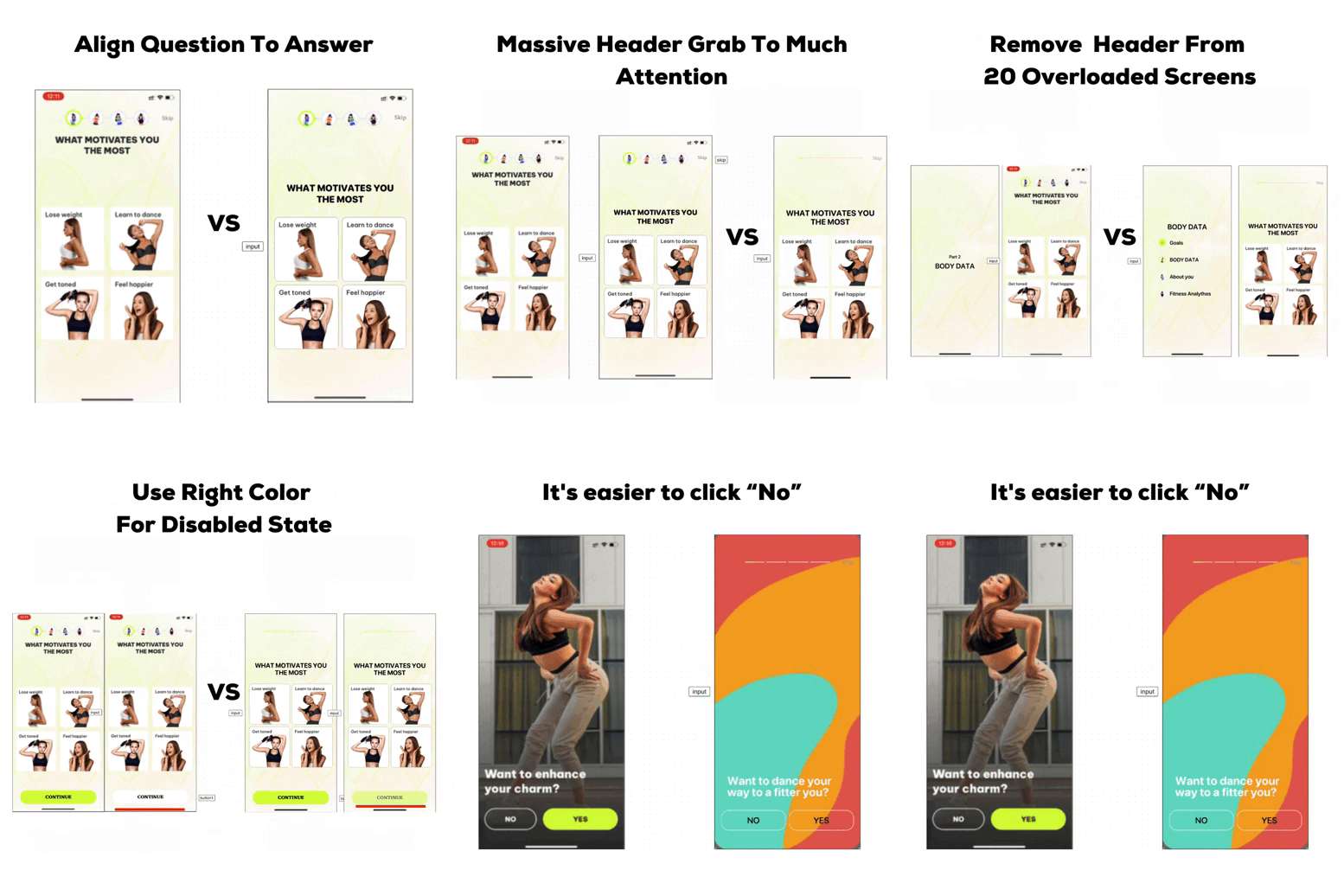
❌ However, the UI significantly increases cognitive load (it's hard to understand what to do).
- ❓ A large progress indicator with images shows the stage but greatly distracts from the questions and answers.
- ❓ The question text is too close to the progress indicator (making it seem related to it rather than the answer options).
3.1 Next screens with visual clarifications:
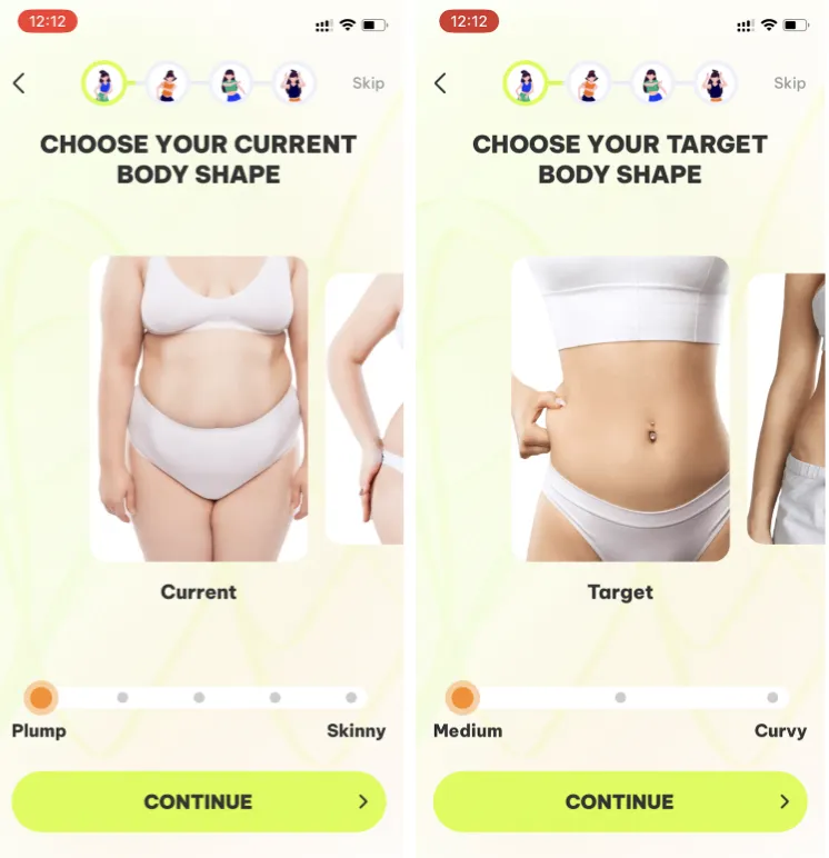
- Current and desired body shape
- Body areas to improve
4. A screen indicating that the next stage is coming:
- The progress indicator in the header is filled to ¼.
- Caption: “PART 2, BODY DATA”
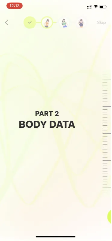
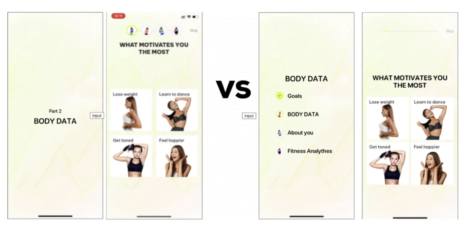
- ❌ There was no "Part 1" screen.
- 🥸 On this screen, we could display all four stages with the current one highlighted. This would eliminate inconsistency and free up space in the header (as done by "Lose It"):
- ✔️ PART 1
- 👉 PART 2, BODY DATA
- PART 3
- PART 4
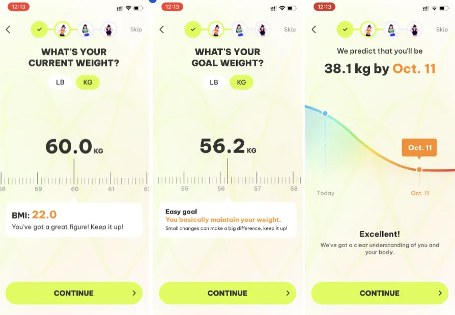
5. Then come two blocks of questions, after which the user receives intermediate results:
- BMI
- Weight loss graph by date
- Social proof of user success
- 6. On the 22nd screen, it excellently shows how the result will be achieved:
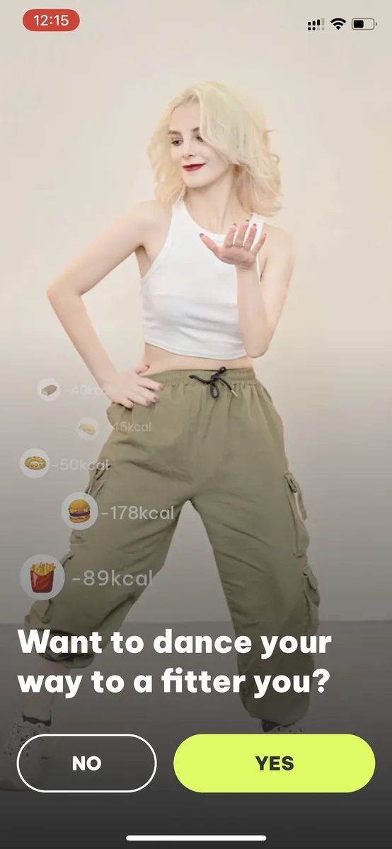
- Image: A girl dancing, calories burning!
- 🍟 89 calories
- 🍔 178 calories
- “Want to dance your way to a fitter you?”
- “No/Yes”
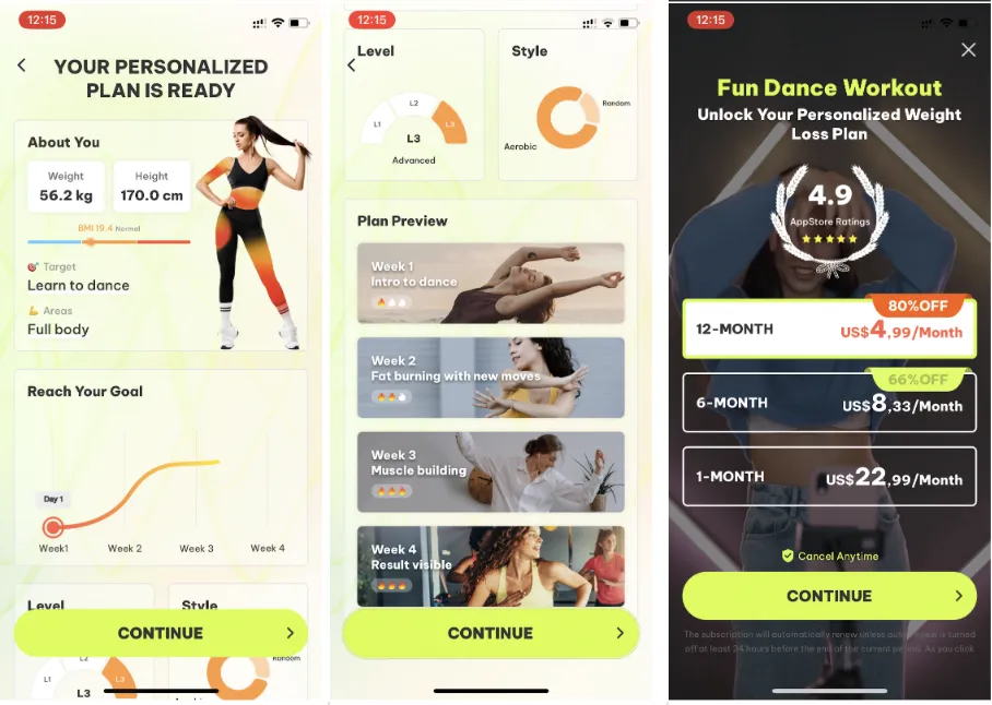
7. Excellent paywall block:
- Combines 'Labor Illusion Effect' with 'Social proof'
- Provides a clear plan on how the result will be achieved (you already feel how you'll reach your goal)
- Paywall
- 🥸 UX/UI Button “Continue”. ❓ They use two different patterns – the button doesn't appear until a value is selected, and sometimes it appears disabled when a value is selected. 💡 Choose one approach.
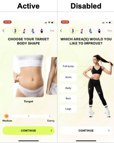
- ❓ The disabled state of the button doesn't look disabled.
- 💡 Check clicks in analytics.
- 💡 Remove the right arrow from the button (it strongly draws the eye, increasing cognitive load).
- 💡 Choose one approach.
Key takeaways
- A launch screen with the app icon and slogan tells users they are in the right place.
- Answer options that name the benefits, like losing weight or feeling happier, clarify what motivates the user.
- Intermediate results such as BMI, a weight-loss graph and social proof reward users after each block of questions.
- A large image-based progress indicator distracts from the questions; one screen listing all stages would do the job better.
- Pick one pattern for the Continue button, and make its disabled state look disabled.