Bumble: Dating & Friends App – Guides the User to the Necessary Functionality Perfectly
In short
Bumble completes the user’s profile during onboarding and suggests a match immediately after it, explains why it needs a phone number or email and uses loss aversion before the search starts. Its weak spots are the goal question on the 20th screen, three permission requests in a row, mixed footers and lists, and a loader that looks frozen.
№ 7 in Lifestyle
👤1M, 💰21M

What you can learn
- The profile is fully completed during onboarding → Immediately after onboarding, they suggest a match (value #F4)
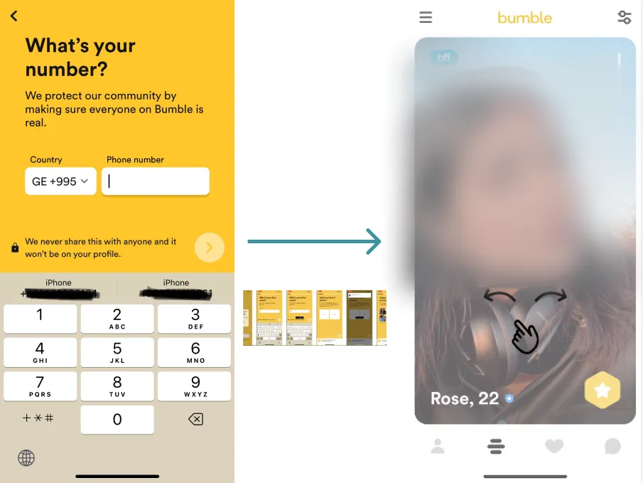
- They motivate users to leave their phone number or email by showing the benefits

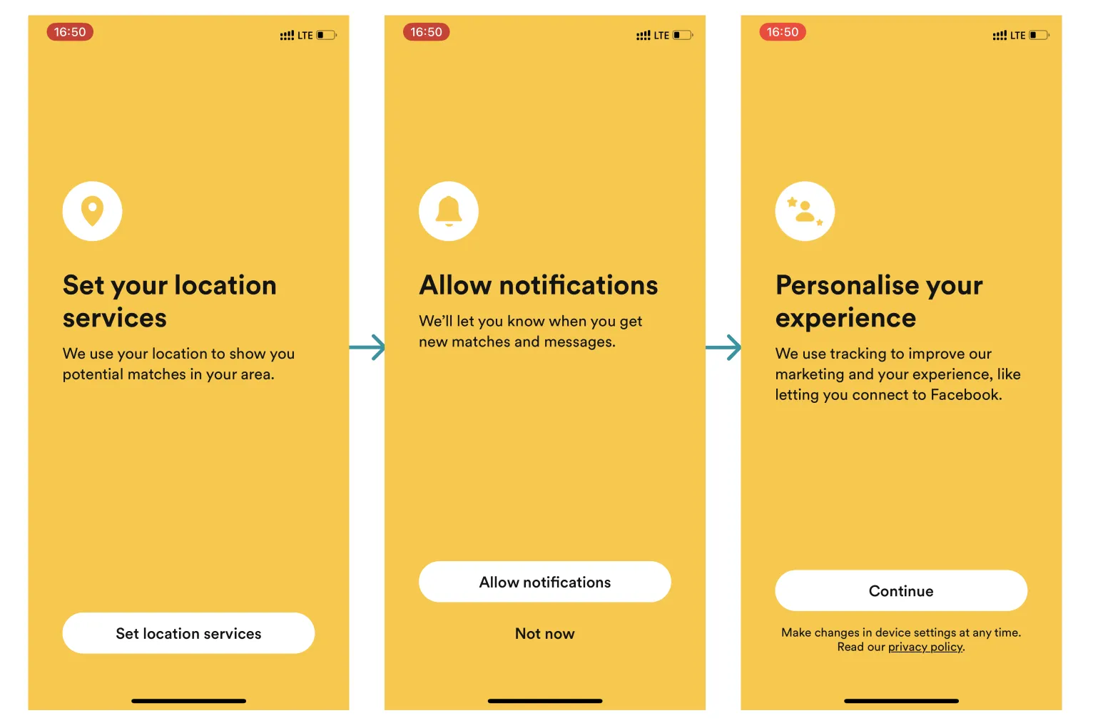
- They explain the benefits of granting permissions BUT... ❓ Three requests in a row – it's tiring, hard not to drop off
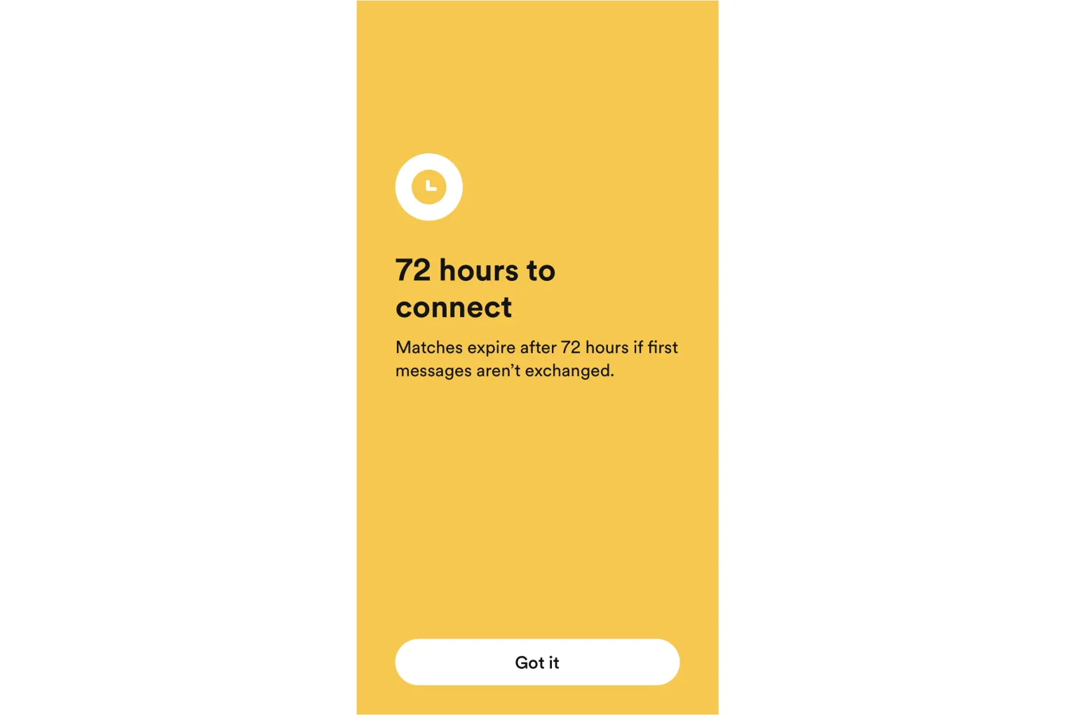
- They use the "loss aversion" effect before starting the search for friends or a partner – motivating immediate engagement (A-ha moment)
What Looks Ambiguous
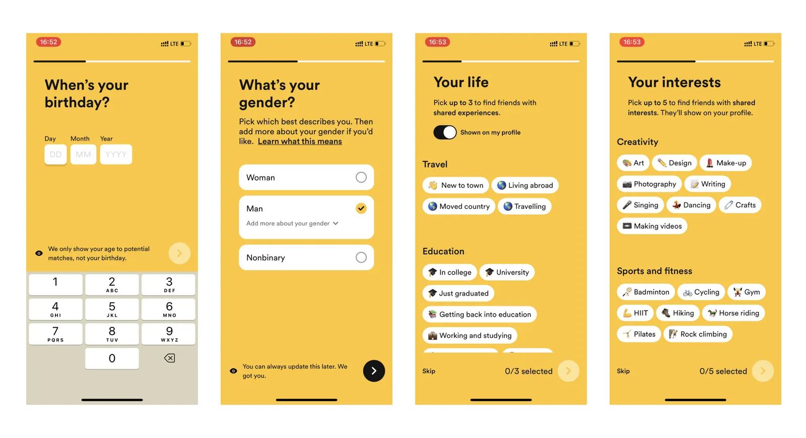
- They ask for the user's goal on the 20th screen → hinders warming up each segment separately, users can drop off without understanding why they entered data on 19 screens
- Six types of footers and three types of multi-select lists → increase cognitive load and decrease motivation
- Loading indicator works incorrectly – it seems that the app has frozen
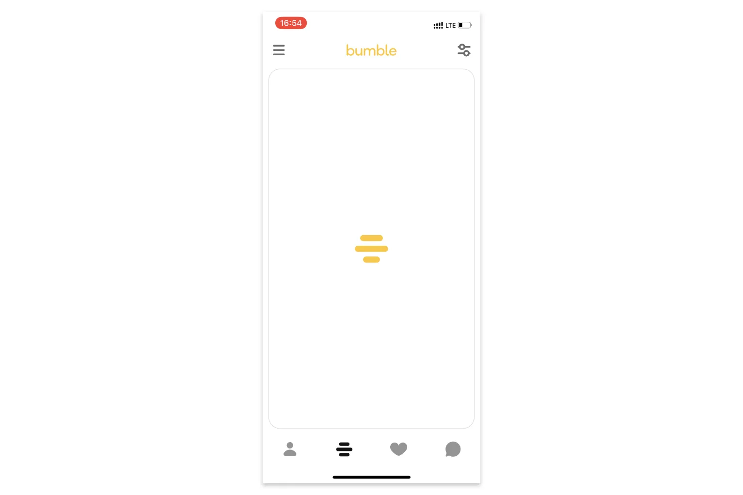
- How to fix: use a progress bar, during filling show the stages of pairing (Labor illusion effect)
The #F4 value is explained in 7 Key Functions of Effective Mobile App Onboarding.
Key takeaways
- Bumble completes the profile during onboarding and suggests a match right after, taking the user straight to the functionality they came for.
- Showing the benefit of sharing a phone number or email motivates users to leave it.
- Explaining each permission helps, but three requests in a row are tiring and make drop-off likely.
- Asking for the goal only on the 20th screen hinders warming up each segment separately, and users may leave without knowing why they entered their data.
- A loader without progress looks frozen; a progress bar that shows the stages of matching would use the labor illusion effect instead.